A soft and elegant mixture of live action and frame by frame Flash animation.
Project: Beech Nut “Just Gentle Cooking”
Client: Beech Nut
Agency: Story Worldwide
Production Co / VFX: Aggressive
Executive Producer: Dan Shapiro
Directors: Alex Topaller, Dan Shapiro
Producer: Hillary Cutter
DP: Joe Arcidiacono
Production Designer: Pam Morris
Storyboard Artists: Rodier Kidman, Riccardo Albertini
Art Director: Rodier Kidman
Animation Lead: Riccardo Albertini
Additional Animation: Santi Agusti, Cristina Cappelletti
Compositing: Dan Shapiro, Santi Agusti
Color Grade: Rob Sciarratta
Sound Design: Wesley Slover
Music: Rhian Sheehan
Notes on the Making-of from their Behance site:
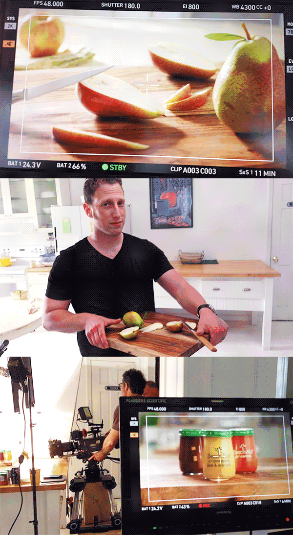
- The live action kitchen setting was shot on a pre-built set in NYC.
- Here's an insight on the animation process. Most of the animation was done straight in Flash

- This is how the rocking pear and most of the animations were made, I first created a guide animation, then I drew it and added the dotted shading (yes, all the dots you see moving in the animation were hand placed) then I made the offset fill and matched the outline with the fill in After Effects.
- Just some puffs, making this kind of stuff is pretty fun.
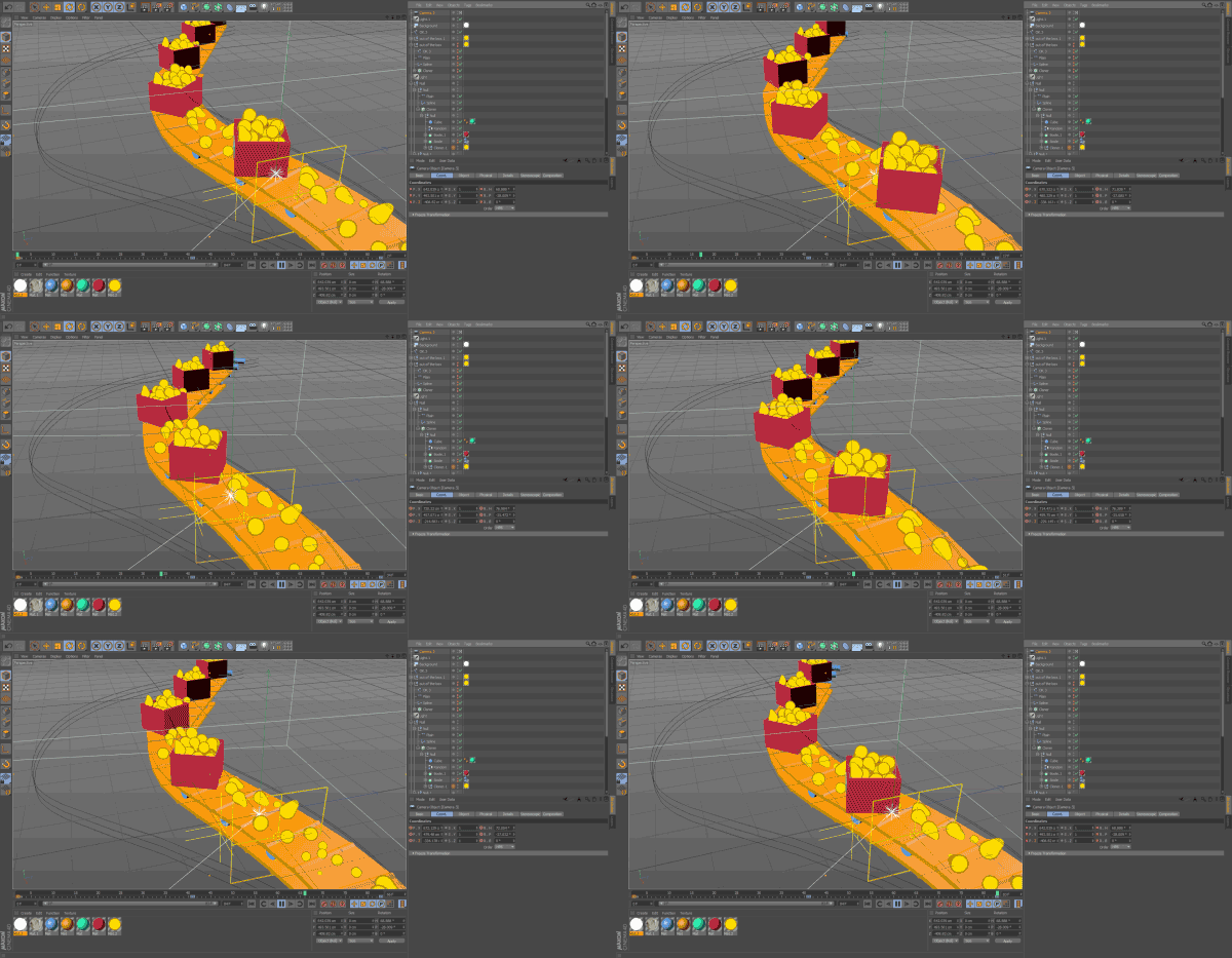
- Some of the guides were made in Cinema 4D due to the nature of certain shots, which required 3D movement. Plus, making the conveyor belt in 3D with Cinema 4D was quick and easy.
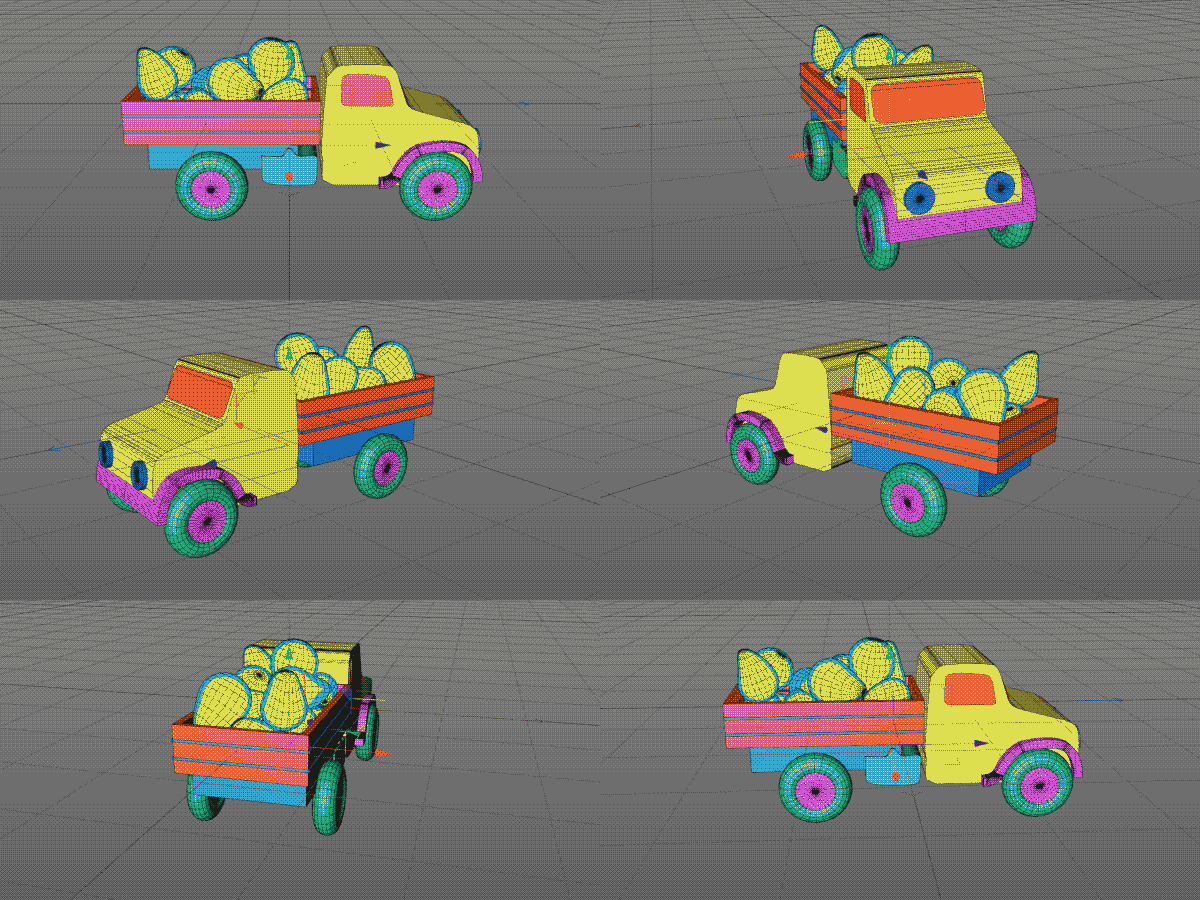
- I also modeled (better say sketched) the truck in a very simple 3D model, so that I could use it as a guide to be traced in Flash.
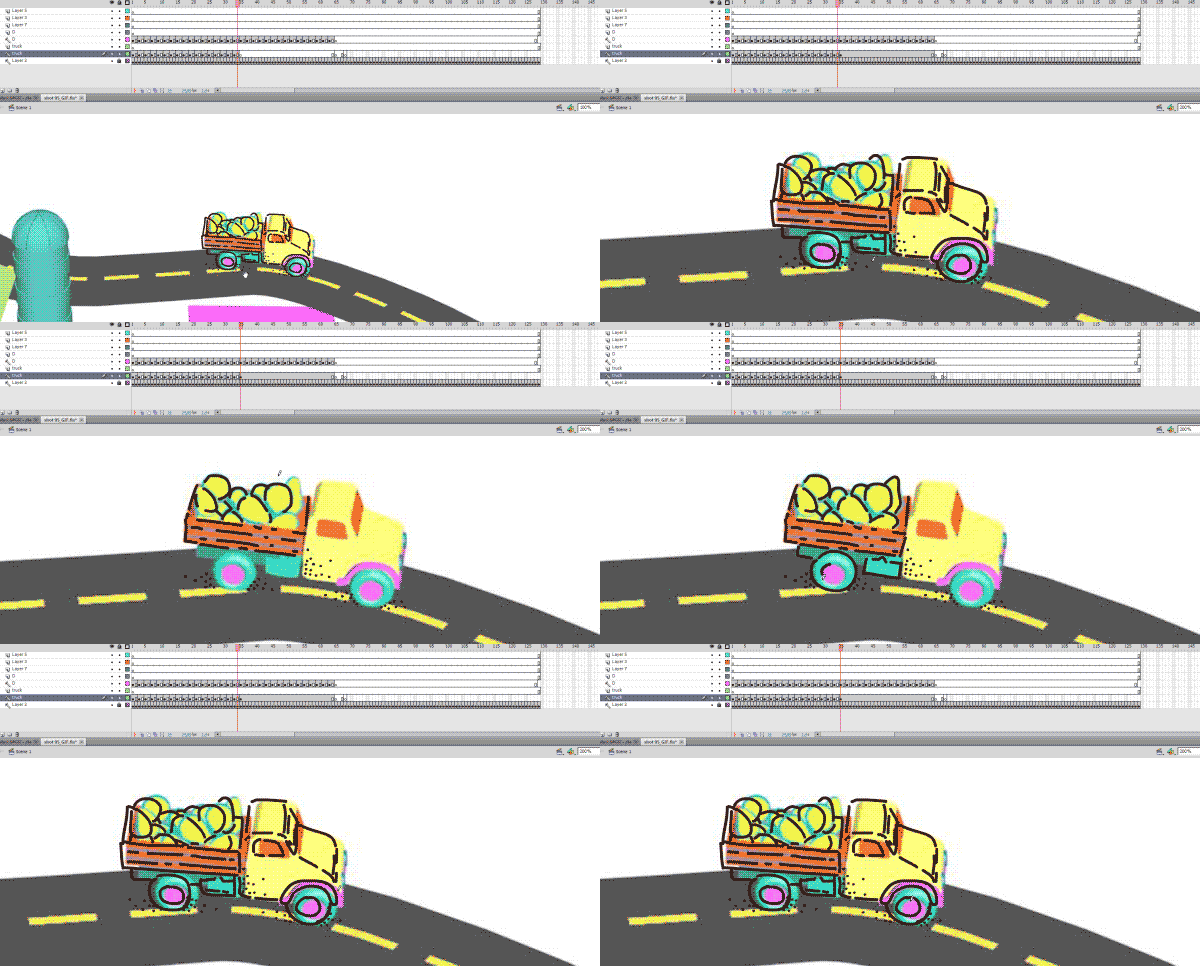
- Here's the truck in Flash, where I was patiently tracing everything. Cinema 4D sketch and toon could have been a solution, but preliminary tests showed very synthetic results, while I wanted a very natural feel.
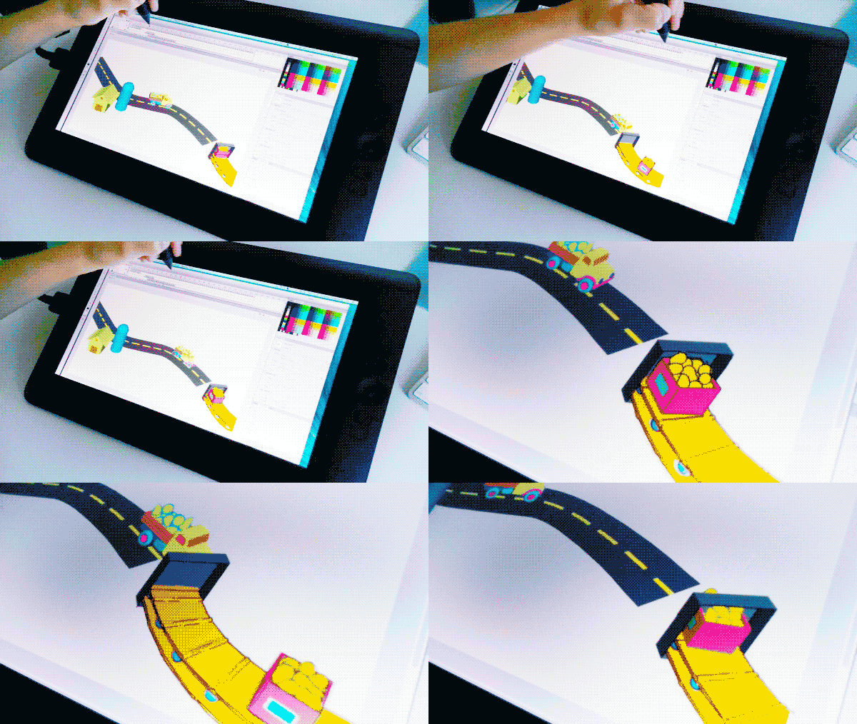
- Working on the conveyor belt.
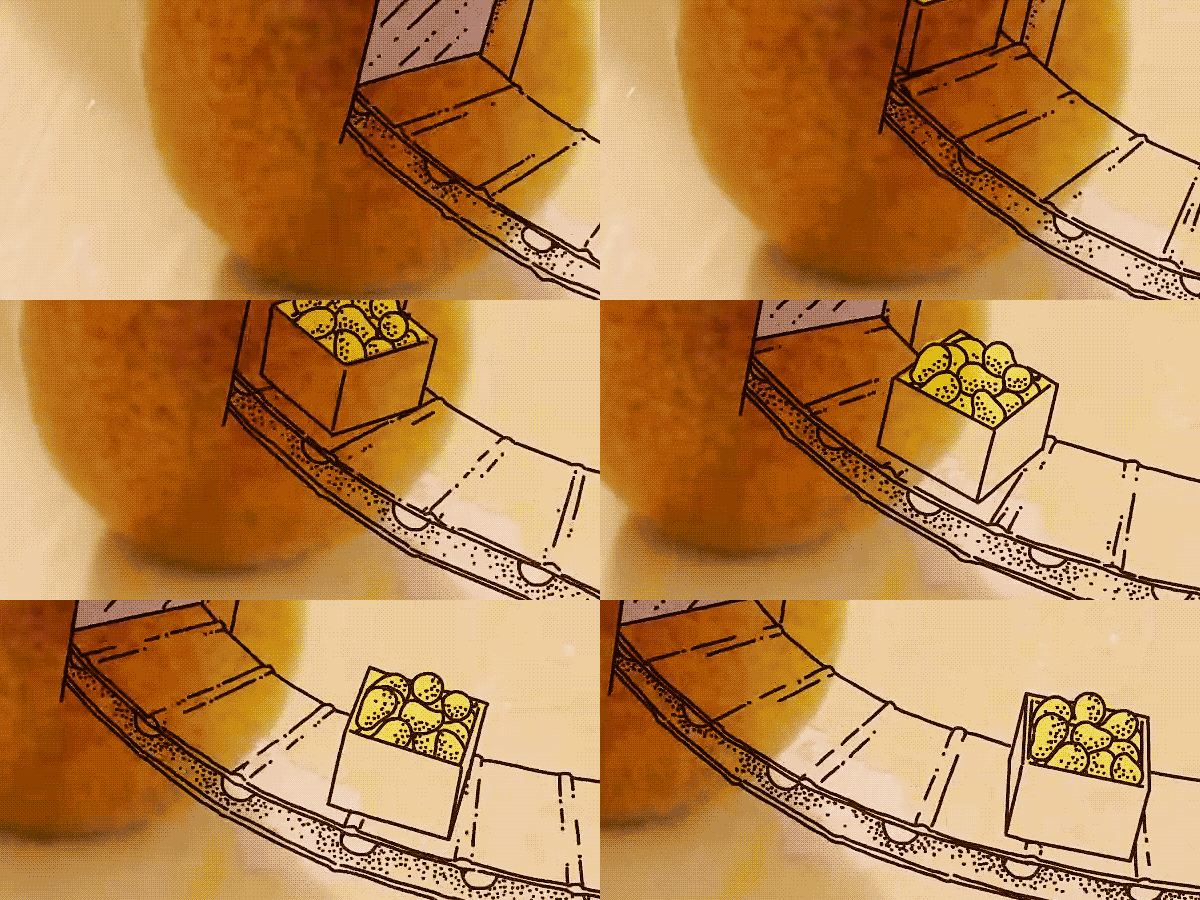
- And this is the final result. As you can see most of the animations were done at 12 fps with some 24 occasionally, based on the motion.
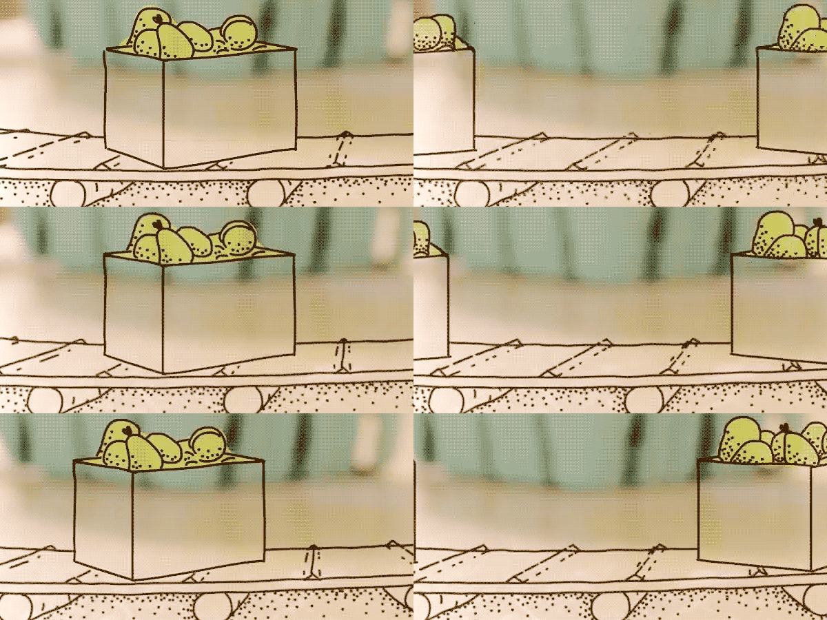
- Plenty of dots! Something important was to give the idea the points were place in a gradient-like design, to better represent the shading.

- Making the sliced up pears was something different as some of the pieces had to move at different speed and framerates.
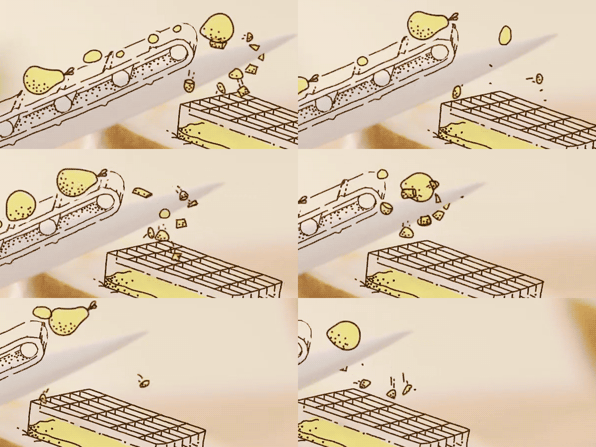
- Here's how they look in the final composition.

- One of the pears floating in the glass of water.
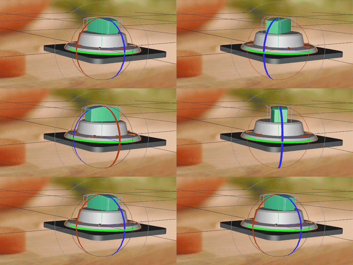
- To be sure it was made with the right perspective and 3D volume, I made the oven knob in 3D before drawing it.

- The pouring cream that filled the pot had to look thick and "creamy". It took me a while to get the right look.

Super beautiful work!
ReplyDelete