The story, characters, art direction and animation are all quite nice, but what struck me to be exceptional was the cinematography. The level of planning needed to achieve the style of scene transitions and camera work was very original and inventive.
The term 'Cinematography' is approached in a different way in traditional animation compared to live-action cinema.
Introduction from the book Setting The Scene - The Art and Evolution of Animation Layout:Cinematography in traditional hand-drawn animated films is made by a collaboration of several people: First by storyboard artists and then by layout artists. The Storyboard Artist take the script and visualizes it, planning out the scenes and sequences, showing how each shot is to be framed, the angle of each shot with basic rough character posing, timing, and acting for every scene.
"To date, the history of cinematography has tended to focus on directors of photography (DPs) and lighting/camera people working with live-actors, either on location or in studio sets. The movie images these people create are a product of lens and light, not pencil and paper. In their worlds, drawing is a tool of the set designer and art director. To students of screen craft, then, the idea that cinematography itself can be created by draftsmen may seem a little odd."
The Layout Artist take the storyboard art and produce the final blueprint and setup for each scene to make it ready for animators and background artists to begin creating the final product. The Layout Artists have always seemed to be the unsung heroes of traditional hand-drawn animation. They bridge the gap between the rough storyboard panels and bring the artwork and scenic design to the next level. Using the concept art, designs and models for reference they elaborate on the storyboard's character poses & visual storytelling and they polish it off. They nail down the expressions, body language, scale & position of the character,s and lock down the angle and framing of the shot by drawing the environment and backgrounds the characters are in.
Storyboard to Layout comparison from 'Ghost in the Shell' (1995), directed by Momoru Oshii:
Storyboard
Layout
Storyboard
Layout
In animated productions the Storyboard is a rough guide and the Layout is the map. A similar process is also made in 3D-CGI animated films.
Storyboard
Layout
Final Animation
Staging is the most general of the principles of animation because it covers so many areas and goes back as far as theatre. Its meaning, however, is very precise: it is the presentation of any idea so that it is completely and unmistakably clear. An action is staged so that it is understood, a personality so that it is recognizable, an expression so that it can be seen, a mood so that it will affect an audience. Each of these are communicated to the fullest extent with the viewers when the film is properly staged. What both the Story Artists and the Layout Team collaborate on is to create the staging for ever shot of the film.
Cannon Fodder's story presents a series of events occurring over the course of a day to the members of a single family living in a dystopian city which is completely dedicated to firing enormous cannons at a distant, unseen enemy.
So what's so different about the staging and layout of this film? For its entire 22 minute length, it is all animated in ONE CONTINUOUS SHOT.
I was introduced to this film in 2001, one of the layout artists on my crew recommended it to me. I later found out it used to be required viewing at the Vancouver Film School Classical Animation course and the Sheridan College Classical Animation program. I was completely mesmerized by the film, and on a technical level it blew my mind for how the director was able to achieve the effect of one long take for the entire film.
Even though the sorrowful inhabitants of this regimented city look to be completely broken and defeated, they also seem wholly unaware that there is anything wrong with the way they live. Their lives may be miserable, but that is, apparently, how it should be. They endorse the standards of their society, are completely dedicated to destroying an enemy none of them has seen, and worship their leaders, hoping to emulate them. While such themes are less than subtle, they are not presented in a heavy-handed way. The viewer is, as a consequence, entranced by the episode throughout its duration.
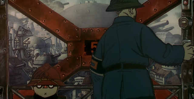
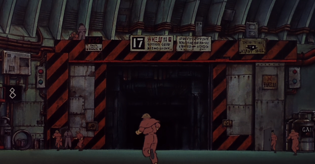
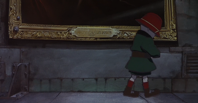
The cyclopean towers of the city are truly awe inspiring, as are the cavernous interiors of the domed turrets in which the impossibly large cannons are kept. The animation is stunning, raw, dirty, textures, greasy and rough. All these elements are rendered in such exquisite and rich detail that the viewer is likely to be enthralled by the strange majesty of the story's town. The city's inhabitants are drawn in an equally accomplished but much sketchier style to have them pop out of their environment and to add to the grittiness of the whole film.
But what I'd like to focus on here is not so much the stories and characters, but the staging and layout of the entire film. The use of light and dark, color and texture, depth and perspective are all part of the draftsmanship and art direction of the film's camera work and environment art. But the fact remains that it was all planned and executed to be ONE LONG TAKE, and that is an achievement worth pointing out.
Granted, there are lots of cheats in the film to achieve this effect, like overlay wipes and some partial cross-dissolves, and there is some computer generated background elements that have hand-painted backgrounds mapped on to a 3D surface to create the proper moving perspective. There's some tricks, transitions, and techniques used in this animated film that I still can't quite figure out how they did some of the transitions.
Here's images from the Art of Memories book, showing the scene planning and designs that goes into these shots.
Photos courtesy of Tekkoman.
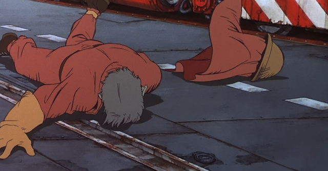
As I researched this film online, I could barely find any information on the movie or its production, so I've made some screen captures to give you a sense of the film's cinematography, but these stills don't do it justice. you must see it all in motion because all these shots are all seamlessly blended together. The compositions and scenic designs are as good as it gets, it does not have the look of your typical Anime; the muted color schemes, the sketchy linework, and highly-textured environments are all wonderful to observe. If you are an animator of any sort, or a big lover of animation and its craft, then you MUST dedicate 22 minutes to watching this film, I highly recommend it.


I took the liberty of photographing the Cannon Fodder pages out of my copy of the Memories Art Book. They show meticulously planned storyboards, however I believe they are intermediate 'workbook' drawings. Not a luxury with such a complex film!
ReplyDeletehttps://we.tl/B2wyyFMr7Y