The line of action is a key ingredient to making your character’s poses look more dynamic.
As shown in this post, the position and posture of the characters in the scene can greatly effect the staging and composition for any animated scene. In addition, it can help to place the characters within the situation, making them part of their environment and the story.
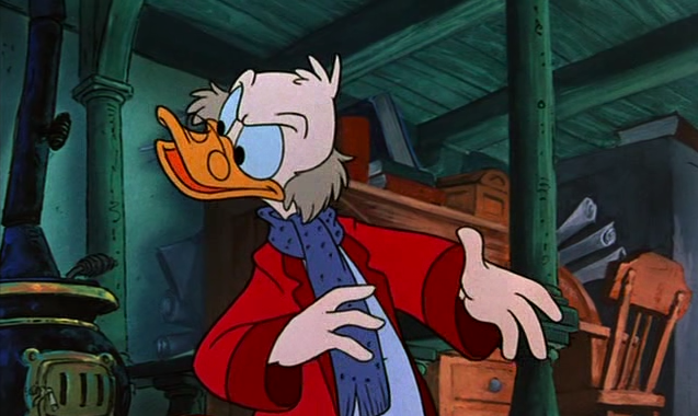
To the right here... See the line of action that runs through Scrooge's body? There's a clear and present flow to the pose.
Some ways to strengthen the pose (and overall composition) of the character is to create a nice silhouette, this is the overall shape of a pose. This shape should read clearly even if the pose were filled in black you would still be able to tell what the character is doing.
The use of negative space and overlapping shapes for posing characters creates clear silhouettes, see the empty spaces between the arms and legs and major forms in these drawings:
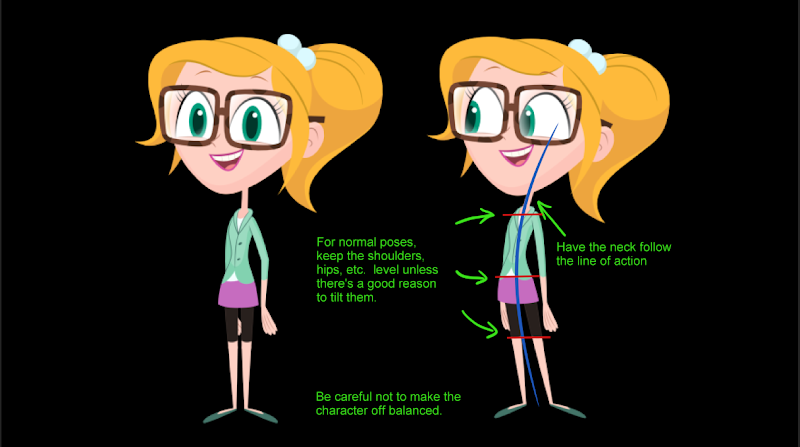
Another method is to create a strong line of action through your character. This helps your poses "read", it makes them clear and understandable and gives them a distinct non-ambiguous direction.
Here's some Preston Blair examples with Tom & Jerry:
If you study classical paintings, photography, comic books, and graphic design - you'll find that they all use this same principle. You need only to look at nature to find these lines of action:
The one thing that will really bring your drawings to life is that 'line of action'. You can think of it as the back bone of a character or just as the imaginary line that dictates how the body will move. This line should always be used in setting up a pose.
You use these action lines when you create the posing of an animated character. It will help you translate a strength and intention, and it give "a direction" to the body.
If you vary angles, perspective and directions, it can help in making a pose more dynamic.
That’s how the artist can really transmit a sense of weight and movement through the drawings.
Even hair and clothing can help give a flow to the poses.
Lines of action are not limited to characters alone, here's samples from Bill Peet on how these invisible lines of direction and force can be found in the overall layout of a well composed scene or illustration to create rhythm, flow, and a focal point within the shot:
Most storyboard artists and animators follow this method as a basic principle for planning out the acting and motion of the animated characters - their attitude and behaviors become expressed through their physical body.
Body language comes in clusters of signals and postures, depending on the internal emotions and mental states, there is lots of non-verbal communication going on in every pose, see samples here.
Here's an article by John K. where he specifies how animator Ed Love connects consecutive poses together. He doesn't always do an antic and an overshoot, and he doesn't time the connections the same way for each pose. What he does do, is control the whole sequence with a hierarchical structure of poses. Some poses and actions are more important than others, and he uses all the drawing and animation tools to keep your eye following the important parts of the action.
 Here are the 2 poses we see and feel in the animation. They are holds. They are drawn with perfectly clear negative spaces, contrasts and lines of action. The action happening between them is visually obvious. Buzz stretches Woody up. The action is clear in just the still poses.


 Not every part of the second pose overshoots. The overshoot is focused on the main part of the action: Buzz' arm stretching Woody.
 Focus of action gets to the final pose first. The rest catches up.
These lines of action can be found everywhere.
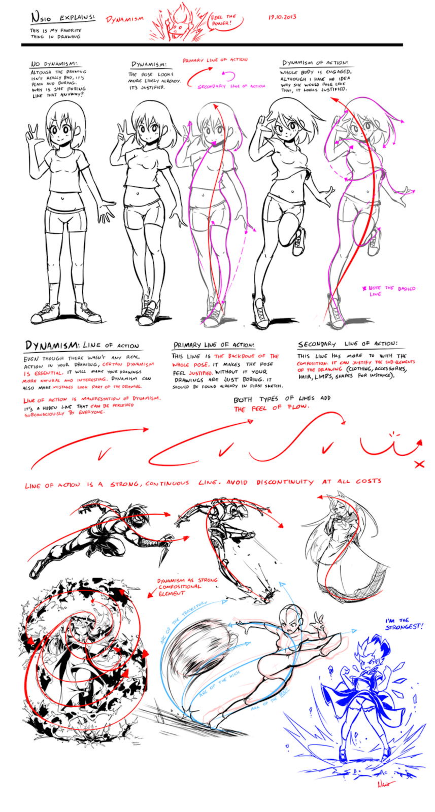
Here's another description of dynamic action lines, by Nsio:
Look at these fantastic examples of very strong lines of action applied to these poses, made by Kitty Fung:
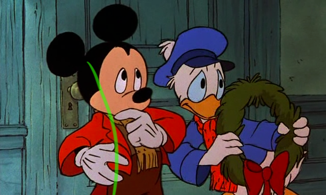
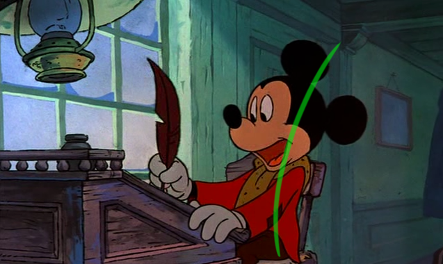
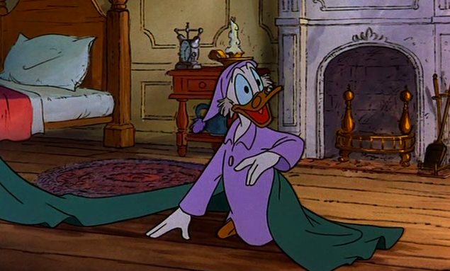
So when I watched Mickey's Christmas Carol on television last Christmas, I knew I had to take a few screen captures from this classic. As shown here in these 150 I've put on display, these poses help illustrate the power of this imaginary line extending through the main action of the figure. You can clearly see how the body bends and forms their emotions, for the purposes of effective body language and visual storytelling techniques. The characters' moods, behaviors, intentions and acting are all enhanced from these strong lines of action.
So you get the idea.
I've also shown a few samples of the Rule of Thirds in action as well. This rule applies to the method of always having one or two 'hotspots' within any given scene, and if one were to align the subject within the range of influence of these hotspots, it always makes for a more energetic and interesting composition.
In animation layout, imagine a pair of lines dividing the picture into thirds horizontally and a second pair dividing it into thirds vertically. Place the most important visual element (usually a significant object, the character's face or sometimes the eyes in a close-up) on one of the points where the lines intersect. Live-action cinematographers use this rule very often. Following this "tic-tac-toe grid" ensures that the main focal point is off center, well balanced, and allows some open space in front of the characters.
Here's lots more samples of strong postures. Observe the line of action and how it conveys the extent and direction of the pose.
You can also create dynamic compositions that help to tell the story by using action/reaction poses. One character causing the action, the other character(s) react or follow the action. By using Opposing Poses like in the examples shown here, you can have characters curved or directed on an arc, other characters have straighter poses, but still aimed on an angle. This kind of dynamic posing sure beats the hell out of characters standing straight up and down all the time.
Incredibly strong and clear poses, observe how every character and situation have their own distinct lines of action.
There are lines of action in the environment also, these leading lines are naturally occurring lines that direct the viewers eye and draw attention to certain parts of the shot. Usually the character because that is the main focus, background elements and props are designed and positioned to lead the audience's eyes.
See how that line in the background intersects through (behind) his eyes, it's done on purpose to create a focal point with the strong line of action in his pose.
Lines of action can help with showing a character's dominance over another.
Lines of action that run through the spine can display confidence or shyness without any dialogue.

Triangular composition occurs when the placement of the subjects (or group of elements themselves) form the shape of a triangle. Sometimes to create depth, other times to break up the image for variety in spacing and positioning, and often to create a connection or relationship between the different subjects.
Look at these sample model sheets from another Mickey short, meant to be used as reference since they are action poses or "extreme" poses, but the line of action is still present. There's a clear sense of weight and force in the poses, and the negative space around the pose creates a clean silhouette.
This clarity in visual language is what helps to create beautiful animation.
Above: the combination with the contrasting poses happening you have some nice simple staging happening here.
Below: the overlay of the window frame, the perspective of the ceiling/fireplace, the position of the characters (all different heights and scale), the placement of the lamp, angle of the chairs, table and snow on the foreground window pane, all help to create a simple and appealing composition.
Observe the line of action of the poses and how it compliments the staging of the shots and the attitude of the characters.
More triangular compositions, and observe how the characters' postures play off each other.
Here's the only line test footage of rough animation I could find:
In my opinion, this 1983 holiday special ranks at the top, alongside other timeless classics like How The Grinch Stole Christmas and A Charlie Brown Christmas. First-time director Burny Mattinson (listen to a great podcast interview with the legend here) did an exquisite job, after working as an animator for 10 years this was a fantastic leap into masterful storyboarding & directing. Not only does it display well executed character animation, but designs, backgrounds, colors, perfect timing and acting, with a fantastic mood and atmosphere as well.
Here's a Behind The Scenes Special:
Mike Peraza was an artist who worked on the special, here you'll find him talking about is memories regarding how the production came to be.
Staging your characters involves many different aspects - Composition, lighting, perspective, camera angle, negative space, visual balance, the scale of the character compared to other elements on screen, avoiding tangents, parallels, and twinning, all while using the characters' mass, size and overall shape as part of its personality. In addition, a nice balance of curved and straight lines in a character's postures and actions must be achieved to compliment the acting intended. The attitude and behaviors of the character, facial expression, and body language are all things to consider when creating a set of poses. The stronger the poses the more appealing the animation will be. The Line of Action can help you in creating those strong poses, and better storytelling.













15 comments:
That was super interesting. Thanks for that. Maybe next time you can continue something in that vein and explain the tangents and twinning bit further! I could read this all day. I love reading your blog.
Wow!! Nice post!
beautiful!!! please keep em' coming!!!
Very interesting and useful. Thank you
sweet stuff,
thanks for all the work!
I'm not an animator, but this has given me some great pointers for my character designs and illustrations.
It;s refreshing to see such sound theory backed up with plenty of examples, so thank you for this.
Wow, amazing, thank you for putting this together and sharing!
thank you for this wonderful stuff .
about line of action if we stick our foots on the grand and just move our head we will see it can create curve line in body . we all have some space around us as teritory that want to save that and if some one want to be close to that. our head that is base of that teritory want to be change its place to be in peace .and this space is diffrent for diffrent kind of people . and when we sneak our foot go first to be sure the situation is peaceful and after that our head go . when we are angry we want to infulance to others space as soon as we could .
thank you for sharing this valuable information
thanks for taking the time to do this really appreciate it
that was great;)
thank that was really helpfull
Thank you so much. I never thought that so many different aspects are there in animation.
Thank you for this info.
Could you tell me where these pictures come from? 1) The Mickey Mouse "This is what's called a Wooden character" picture, 2) the Wile e Coyote "Alert yet relaxed sit" picture, and 3) The one above Wile e Coyote with Stealth, Trepidation, etc poses.
Thanks again. I could put the theory into practice right away thanks to all the examples!
Andy
@ Andy: 1) is from a "How to draw Mickey comics" tutorial, and 2)/3) are from the "Chuck Amuck" book (Chuck Jones' autobiography).
wow amazing consep cartoon,,, i like wald disney cartoon
Post a Comment