June 30, 2016
June 29, 2016
June 28, 2016
June 27, 2016
June 26, 2016
June 25, 2016
June 24, 2016
June 23, 2016
June 22, 2016
'Sven Hoek' (1992)
This is definitely my Favorite Ren & Stimpy Episode.
The posing and expressions accomplished in this story are unlike no other ever made for animation, the sequence of Ren's 'calm freak-out' at the end is a masterpiece of animated cartooning.
Lucky Charms Commercial - Pool Party
Produced by 2veinte
Creative Direction: Pablo Gostanian
Executive Producer: Agustin Valcarenghi
Animation Direction: Melisa Farina, Sebastian Garcia
Art Direction: Pablo Gostanian, Gastón Pacheco
Character and background design: Gastón Pacheco
Illustration: Gastón Pacheco, Nahuel Sagarnága
Lead Cel Animation: Melisa Farina, Sebastian Garcia
Cel Animation: Fernando Toninello, Juan Nadalino, Ana Artaza, Facundo Quiroga, Valentina Candia, Franco Pelicciaro, Juan Pontaroli, Carolina Borovich, Javier Vicente
2D Animation: Daniel Di Paola
Clean Up: Juliana Gorgati , Juan Nadalino, Facundo Quiroga, Daniel Di Paola, César Jara, Nahuel Sagarnága, Ana Artaza, Franco Pelicciaro, Alex Gostanian, Diego Frachia, Juan Pontaroli, Matias Giamportone, Hugo Gomez, Lionel Skliar
Storyboard: Sebastián García, Juan Nadalino, Melisa Farina, Gastón Pacheco
Composition: Daniel Di Paola
Producer: Ángeles Blasco
Music and SXF: Saatchi & Saatchi NY
June 21, 2016
'Mortal Breakup'
A Film by Paula ASSADOURIAN, Marlène BEAUBE, Débora CRUCHON, Maxime DELALANDE, Thibaud GAYRAL, and Batiste PERRON
June 20, 2016
June 19, 2016
June 18, 2016
Donald's Snow Fight (1942)
Donald's Snow Fight is an animated short film featuring classic cartoon character Donald Duck in a boisterous snowball fight with his nephews Huey, Dewey and Louie. Many sequences were animated by the incomparable Ed Love.
I loved this short when I first saw it as a kid, it really taps into a young child's imagination on how more epic you see the big snowball fights you'd have as a kid, or at least it would reflect how much kids WISHED they could have grandiose snowball wars just like this.
I loved this short when I first saw it as a kid, it really taps into a young child's imagination on how more epic you see the big snowball fights you'd have as a kid, or at least it would reflect how much kids WISHED they could have grandiose snowball wars just like this.
June 17, 2016
June 16, 2016
June 15, 2016
June 14, 2016
June 13, 2016
Ralph McQuarrie
Today we celebrate McQuarrie's birthday.
Ralph Angus McQuarrie was an American conceptual designer and illustrator. His career included work on the original Star Wars trilogy, the original Battlestar Galactica TV series, E.T. the Extra-Terrestrial and Cocoon.
Ralph Angus McQuarrie was an American conceptual designer and illustrator. His career included work on the original Star Wars trilogy, the original Battlestar Galactica TV series, E.T. the Extra-Terrestrial and Cocoon.
June 11, 2016
June 08, 2016
June 07, 2016
Visual Storytelling Platform from Craft
New digital platform shares the visual storytelling process with over 70,000 pieces of art from high-quality animated projects including Oscar-nominated features ‘The Secret of Kells’ and ‘Song of the Sea.’
COPENHAGEN -- Startup company Craft aims to create a learning and inspiration center dedicated to the art of visual storytelling by providing creatives access to a wealth of raw, workinprogress material from animation and game productions.

Subscribers to the platform can peruse content by craft, e.g. scriptwriting, storyboarding or character design, or explore material by film or game project. Furthermore, anyone can purchase files from the productions to study everything up close, order beautiful production prints, and buy unique 3D printed character models.
Increasingly, transparency of the creative process is becoming an industry trend, something that Craft aims to further by allowing film and game companies to open up and build an audience during their production. This is not only a major opportunity for the content producers, but also a great resource for creatives around the world.
“In my 10 years in animation, I have experienced the usefulness of learning and getting inspired by what other professionals have created,” says Craft co-founder and CEO Frederik Villumsen. “Craft passes this opportunity on to professionals, students and fans around the world.”
June 06, 2016
June 03, 2016
The Hand-Drawn Cinematography of 'The Iron Giant'
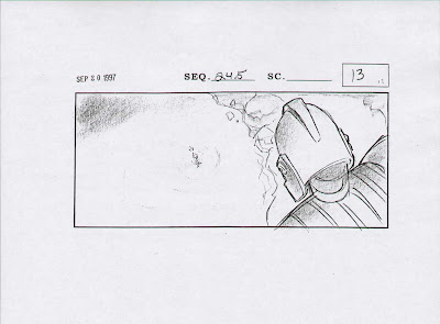
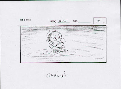
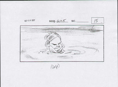
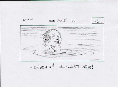
In this post I've displayed a few segments from Brad Bird's 1999 film The Iron Giant.
First, I'd like to talk about certain elements of the Storyboarding process, and how it generally two main functions...
Staging: The positioning of characters in each scene for maximum emotional content and clear readability of actions. In Animation it refers to the purpose of directing the audience's attention, and make it clear what is of greatest importance in a scene; what is happening, and what is about to happen. This can be done by various means, such as the placement of a character in the frame, the use of light and shadow, and the angle & position of the camera. In live-action or 3D animation this is referred to as 'Blocking'.
Storytelling: Each panel's sketch clearly communicates to an audience the important ideas expressed through the action of each scene. This is all compromised of different types of shots, framing / editing principles, and scene transitions, and how they are used by filmmakers to help tell a story. These depict many elements like the poses and expressions of the characters, as well as how the scenes will cut and how close (or far) the camera is to the subject.
Framing, Character Posing, Visual Balance, Negative Space, Layout, Depth, and Perspective are all components of blocking the action of a shot, and it's all at the root of creating hand-drawn cinematography for 2D animated films.
The sketches below show a nice interchange of upshot to downshot that illustrates the powerful/powerless principle. The higher a character is in the frame, the more powerful they tend to feel. And the lower in frame that they are, the more powerless they tend to feel.

Up shots tend to make the character seem bigger, more menacing, more powerful. Down shots tend to make the character look weaker, less threatening, and powerless. The larger the character is within the frame, the more powerful they seem.


Techniques for achieving clarity in storyboards:

All these principles are just 1% of the many tools and methods artists use when creating storyboards for animated films. They are essentially the cameramen for the film, doing a visual rehearsal for how the film will be "shot"-- planning out the character actions & expressions, the FX, the layouts, the design of the shots, and the compositions of every scene.
Up shots tend to make the character seem bigger, more menacing, more powerful. Down shots tend to make the character look weaker, less threatening, and powerless. The larger the character is within the frame, the more powerful they seem.
Techniques for achieving clarity in storyboards:
All these principles are just 1% of the many tools and methods artists use when creating storyboards for animated films. They are essentially the cameramen for the film, doing a visual rehearsal for how the film will be "shot"-- planning out the character actions & expressions, the FX, the layouts, the design of the shots, and the compositions of every scene.
Those responsible for the visual composition of The Iron Giant...
Cinematographer:
Steven WilzbachStoryboard Artists:
Viki Anderson
Mark Andrews
Irina Goosby
Ron Hughart
Brian Kindregan
Piet Kroon
Steve Lumley
Steve Markowski
Moroni
Teddy Newton
Kevin O'Brien
Fergal Reilly
Harry Sabin
Mercedes J. Sichon
Dean Wellins
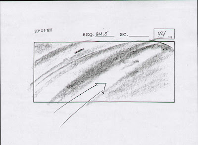
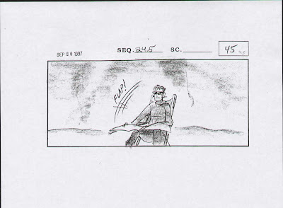
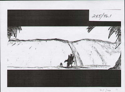
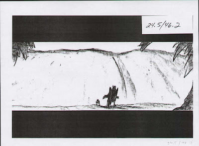
Here's the samples.
Click on any image to make larger.


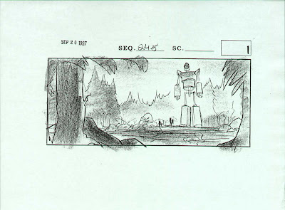
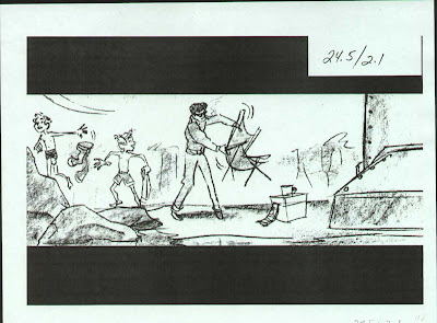
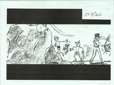
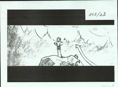
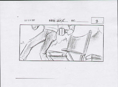
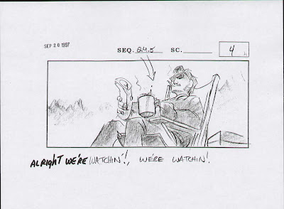
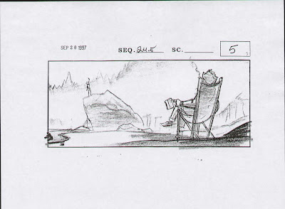
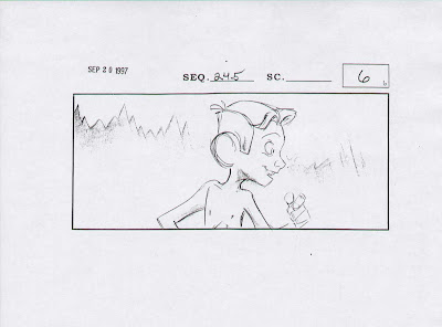
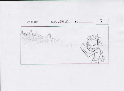
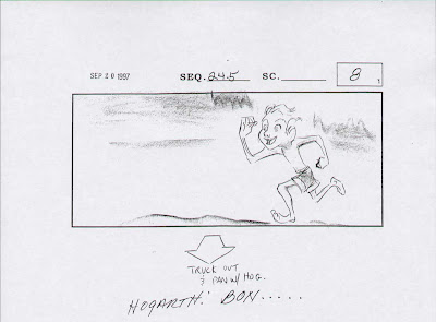
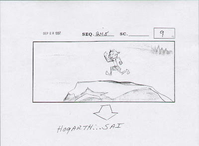
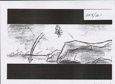
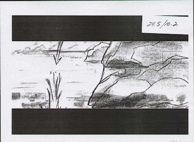
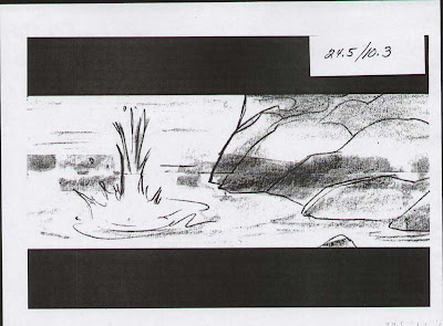
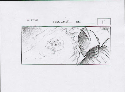
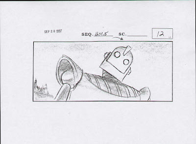
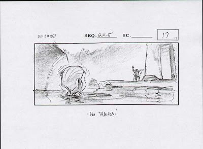
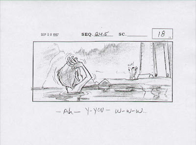
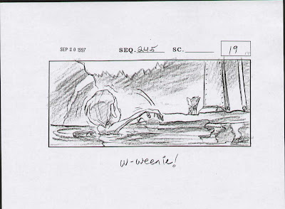
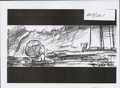
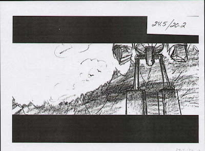
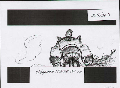
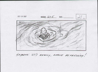
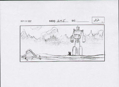
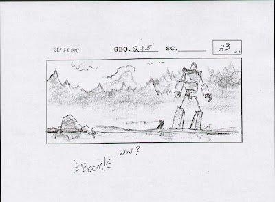
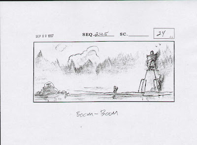
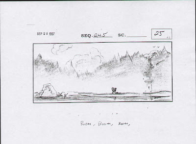
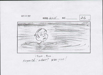
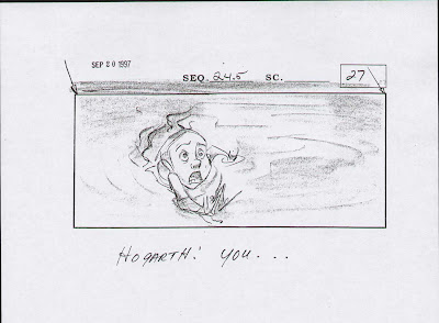
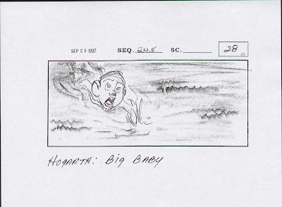
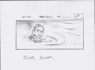
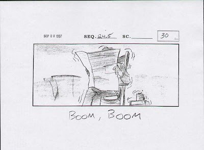
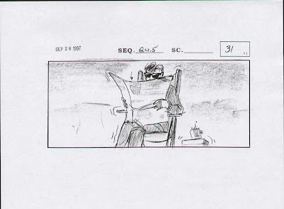
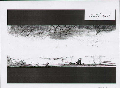
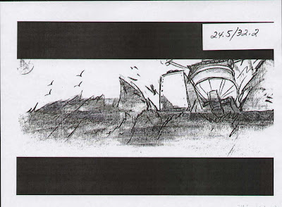
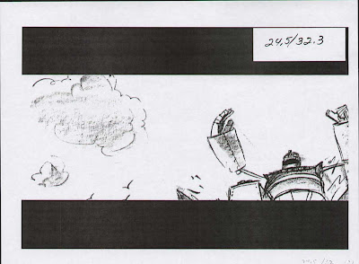
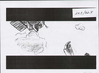
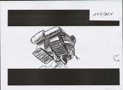
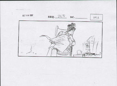
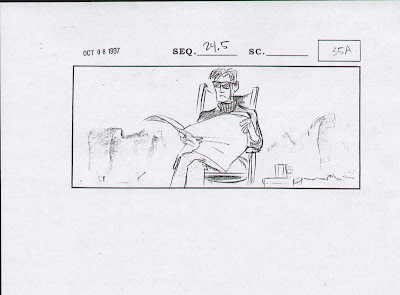
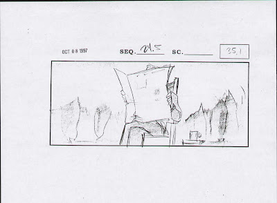
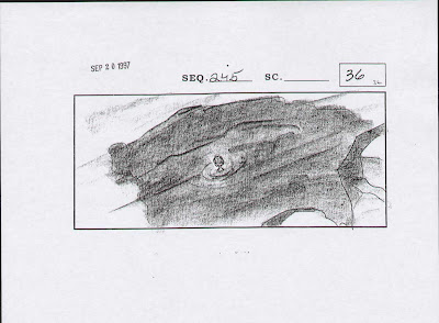
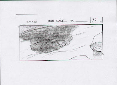
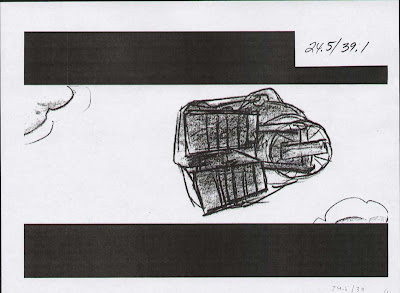
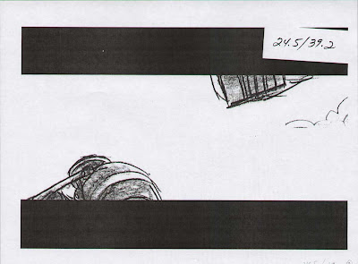
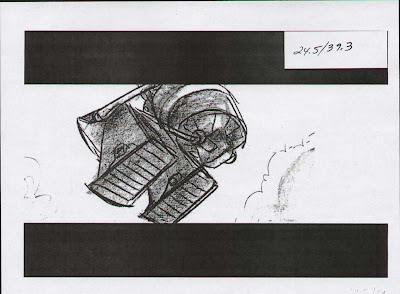
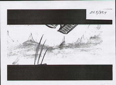
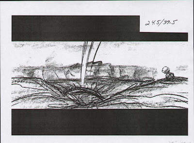
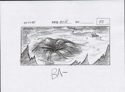
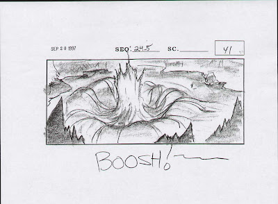
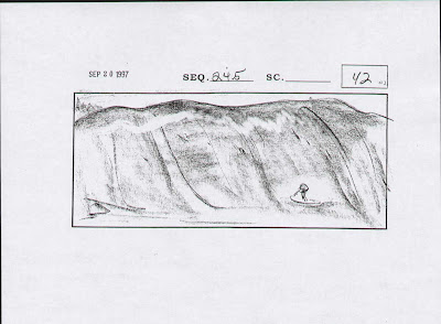
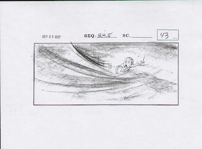
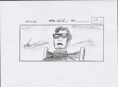
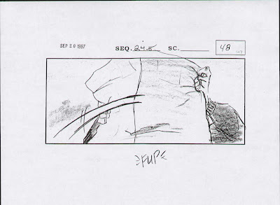


Mark Andrews
Irina Goosby
Ron Hughart
Brian Kindregan
Piet Kroon
Steve Lumley
Steve Markowski
Moroni
Teddy Newton
Kevin O'Brien
Fergal Reilly
Harry Sabin
Mercedes J. Sichon
Dean Wellins
Here's the samples.
Click on any image to make larger.
Sequence 19.7 - Hogarth Teaches Giant


Sequence 19.8 - Kent with the Mayor


Sequence 21.8 - Comics in Barn


Sequence 22.9 - Hogarth Tucks Giant In


Sequence 23.7 - Can't Shake Kent / 2 Kinds of Junk


Sequence 24 - Giant Spins Hogarth


Playtime at the Lake


Giant Strolls Thru Town


Battle, Giant on the Run


The following are lighting studies for the layout artists, created to add strong compositions to the scenes, to help artists and painters later on to determine the light sources in their scenes and where to apply the shadows on characters and backgrounds.
Labels:
Cinematography
Subscribe to:
Posts (Atom)


