See Part 1 here, and Part 2 here.
Continuing with my case study of the shot compositions from Pixar's film "The Incredibles". All images used here are ©Disney/Pixar (unless otherwise stated).
Cinematography is the art of composing the scenes of the film so they can visually tell the story in a functional and creative way. The purpose of composition is to direct the viewer's eye to the central point or "story" in your scene. Regardless of the particular subject, composition of the frame is important. The Incredibles has accomplished an appealing, efficient and artistic way of shooting all the sequences of the film to truly place the audience inside this world, and thus allow the viewers to get lost in the story.
Over and over again, the Rule of Thirds, Perspective/Depth, Intersecting Lines, Negative Space, Leading Lines/Diagonal Lines, Triangular Composition, and Character Line of Action are all displayed through out the second half of the film - in ways that show visual balance, and the relationship / connection between objects and characters within the frame, while helping to emphasize the development of the characters, along with their performance and the progress of the story.
Notice Bob standing out from the foliage and trees, his color and body shapes helps with that, but mostly it's how well they've positioned the leaves and jungle elements around him, these elements create a frame within the frame.
In Illustration, Photography and Advertising Design - the arrangement of graphic elements, colors and lighting create a flow and direct viewers' eyes to certain area in a composition. But in film, there is another factor to consider, and that's Movement, it is also a major component in influencing the focal point. It can be broken down to the contrast between these key aspects - stillness and motion, fast and slow, movement pattern and travel distance.
This is what makes Cinematography unique to all other forms of image composition. Elements moving within the frame and the frame itself (the camera) moving as well, causing the composition to be ever changing and organic.
Up shots, down shots (high angles/low angles) are all present and accounted for, all to keep the action dynamic, clear, and exciting. You see over-the shoulder shots, arial shots, tracking shots that pan or follow the action as the character moves about the frame.
Bob realizes he's just non winning the fight on these grounds, so he does a strategic retreat, the camera follows him during his escape, but the suspense level remain high as the robot is relentless in his pursuit. Showing the point of view of the robot chasing after him and then reverse shots add a nice element of tension and urgency to the sequence. Bob is tough and seemingly close to being indestructible, but he still feels pain, is rusty in his super-hero fighting skills, and all these shots and how the action plays out help to inform the audience of all this while pushing the story forward.
To see the character thinking we need to go in close and it's good to mix things up from all these wide shots needed to show the action clearly. Bob is just flying by the seat of his pants, his fists can't penetrate the robot's metal body, he's desperate he moves fast, tries different attacks to see what happens.
The shots have a nice variety to them. You can't stay up close all the time, otherwise you're too tight on the subject and you can't see what's going on, it feels too claustrophobic. If the shots were too far and wise all the time, we wouldn't be able to see the important details needed to develop the characters and progress the story.
This is a great part to talk about 'motivating the cut' - closely related to editing as much as composition, but choosing what point of view you want to show the audience works together with when and how to cut the camera. Motivating the camera is a simple technique of using visual cues to set up a cut or camera-move and in doing so, ease the audience into a new shot or new information.
The action is well developed, just when you think its over, the machine remerges, seemingly unstoppable, the shots help to rekindle that suspense and sense of doom. The fiery orange and yellow color schemes sure help with the feeling of danger being present through out the scene.
Again with the dramatic angles, up shots and down shots to make the dominating character seem even more menacing, larger, powerful and in control of the scene.
The camera adjusts to show us what the character is thinking. Looking to where are character was looking (the floating rock as a possible escape route), telling us what his plan is with the position of the elements on screen.
The shots progress closer and closer in the last 3 cuts to make the situation more dramatic, adding to the intensity and giving our audience indication they should feel concerned over our main character.
With Bob's back cracking back into place and getting his second wind, he discovers that punching and throwing attacks at him does nothing, but pulling apart vulnerable body parts seems to work better.
The shots help tell the story, Bob manoeuvres around gradually getting the upper hand. We are reminded that this isn't Bob's first fight, when he's out-powered he uses his wits and strategy to gain the upper hand.
The choices in the view points and angles are meticulous and deliberate, all the help place the audience in situation, in the character's point of view and directly into the action.
The following is the montage sequence. A classic way to show a passage of time, with no sound effects or dialogue in the audio track we have some nice jazzy music to accompany all these carefully chosen shots and scenes to display what seems to be the passage of months going by as Bob loses weight, has more time with his family, is generally happier with his new covert operation career, is making more money, buying new things... all masterfully showcased in this montage.
Camera pulls out to reveal the bow on a new car, you see just enough of it to know what it os, and still see Helen's body language reaction in the far background.
Classic method of showing both characters on screen, seeing the foreground character's reaction clearly, then push the focus of the camera lens to bring the background character in focus. Nice depth, perfectly clear what is going on in the characters' heads and the what the story point is.
The two shots shown above; classic example of motivating the cut. We start with a close shot, he's bench pressing something, it stays on just long enough to realize what he's doing and wonder what he's lifting, then the long shot of him training by pressing a train.
Here it is again, close up to see him obviously training, the we cut wide to show the audience what's going on.
You see the reflection of his body in the background (gettin in better shape), tilt the camera up to reveal his satisfied reaction.
A point of view shot, this cues the cut to see his reaction to what he's seen, the next shot shows us what he's thinking about the fact his suit is torn.
We instantly get reminded of his battle with the big robot and the fact that Bob had forgotten about it too, setting us up for the next sequence (his visit with his old costume designer, Edna).
Composition's main function is to draw the viewer's attention to what is happening in the scene. This usually means the character, but not always. Sometimes the point of the scene is the background or the prop that someone is holding. Whatever the point of the scene is, the background elements should be composed around this focal point. You don't want to compete with it by surrounding the focus with noisy details and wonky shapes.
We are reminded of how much fun the artists had with the production design of the film. Edna's place is extravagant, post-modern, sleek, clean, and over the top, just like her personality.
It reminds me of when I first looked through The Art of The Incredibles book in 2004, my thoughts on its content were mixed, I had just seen the film, I was excited to see the concept art and designs that was made in the film's production, but I was a bit disappointed, there were lots of very very simple character designs, barely resembling the final product, I was expecting lots of rough detailed super hero concepts that would later get refined and simplified and stylized. Boiling down the characters to their most simplified and basic shapes is an exercise done often to create some iconic looks.
I was a bit confused, I flipped through it a few times, set it aside and didn't give it much thought, I was maybe expecting visually rich, complex, super detailed artwork, paintings and renderings that more closely resembled earlier, rough versions of the final product.
A few weeks pass, and I had some spare time one weekend, I open the book and begin reading it. It usually takes me a long time to actually sit down and READ the text in an art book, cause to be honest, all I wanted art books were for the art. But I felt compelled to read some of it, out of curiosity.
So the book talks about the director's and artists' thought process, the feel, the look, the mood, the aesthetic they were going for in the characters, costumes, environment and location designs for the art direction of the film.
Then my mind proceeded to be.... officially.... BLOWN.
It made me re-think the whole essence of core principles of character design and think about it in new ways. All their crude, paper-cutout style character art suddenly made sense. They write about the visual language of the film and how the characters were designed with their personalities, their back story, and their instant readability/recognizability in mind. They explain how important it was to have very distinctive silhouettes/outlines made when they were developing the characters. So they started off with experimenting with many different BASIC SHAPES and FORMS to help the overall foundation and stylized/blocked-out shape of the characters to be fitting to their natural personality, their powers, their skills, and their story arc.
They go on about the sets and backgrounds as well, but for me the initial mindset they had and how they constructed the characters from scratch like this, really got my brain going, and it got me to profoundly reconsider all the things to consider about the very structure of character design, and how it influences the storyboarding, layout and composition process for all animated television series and animated feature film productions.
Example - "Wander Over Yonder" Style Guides by Craig McCracken & Alex Kirwan:
Sometimes creating an uneven balance of shapes and masses in a frame (large, medium, small), it automatically makes an image deeper, more dynamic, and interesting. Often some characters or elements need to be more prominent for story purposes.
Cuts to these insert shots, usually close-up so you see only the subject matter, only on screen for a brief moment, but each shot is necessary to sell to the audience what is going on.
The way the shots are composed aid in developing the characters, and thus help to structure and progress the story as we go along for the ride with the characters, as the characters discover things, we discover it with them, sometimes the camera reveal information to the audience that the character doesn't know yet, or other times the character gains new information but the camera hides it from the audience, leaving the viewers in suspense either way. The cinematography helps to shape where you look on screen, distributes the information to the audience and makes the viewers feel a specific way in that whole interchange of information as well.
Notice how Edna is now taller in the frame, higher than Bob, and at that moment she is also finally convinced to repair Bob's suit for sentimental reasons. But she does it on her OWN terms. The shots are now composed to have her above Bob in the scene, she's taken control of the situation, she now realizes she will also design him a new suit and relishes the challenge to create something new, more modern and thus a spark is re-kindled inside of her, as she obviously longs for the days that she would design costumes for "Gods" again.
See how that edge of the wooden beam points to her eyes, its purposefully done to lead your eyes and create flow through the image.
Comicbook artists do this all the time, here's a breakdown of a page from a Darwin Cooke graphic novel:
Helen is being all secretive, the framing an angles help to sell that feling.
The cinematography help to convey how Helen is feeling like Bob might be cheating on her, she feels isolated, vulnerable, the weather is even overcast, to make the mood feel a bit more somber.
The following shots is all about the scenery,
Bob in wonderment over the location he's being shuttled to.
For insight on the world of Animation Production Design, I'd recommend "Dream Worlds". The book is truly a unique visual delight, offering information into the development of animation classics like Bambi, Beauty and the Beast, The Lion King, Lilo and Stitch as well as a tantalizing examination of unfinished Disney projects. The author and prestigious Feature Animation Art Director Hans Bacher, has been a major influence on the design of Disney films for over 20 years. His work appears in Who Framed Roger Rabbit, The Lion King, Aladdin, Beauty and the Beast, Atlantis and Mulan, just to name a few.
All shots that help re-establish Bob's new assignment, as he gets back to work for his client. Getting transported to the island and deep inside the facility. He has his new suit, he's back in shape, comfort and confidence is oozing out of him.
Carefully chosen angles that show a characters point of view, then the camera reveals to us more and different information as the story progresses, we follow the characters on their journey, and we are shown the information we are needed to be shown at each particular turning point through out the film.
We know Bob is being setup, we don't know when or how. Here the shots and the music all convey a sense of ease, luxury, paradise, and all that good stuff... too good to be true.
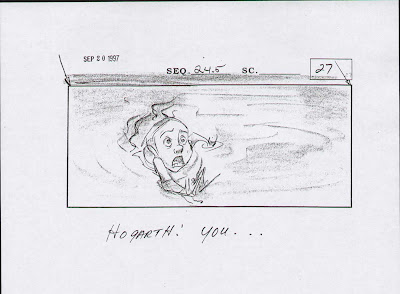
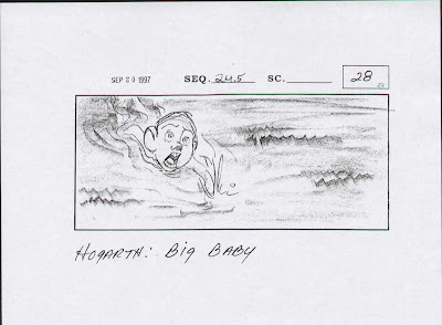
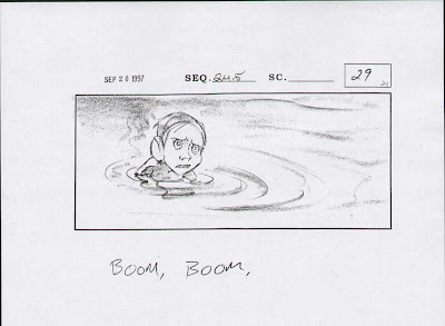
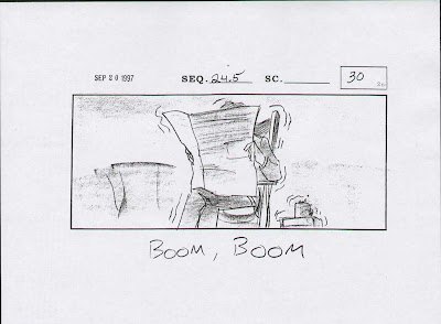
How do they dream up these angles, perspectives, and progression of shots? It all starts with the magical world of story-boards. These sketches help everyone who is in charge of making the film visualize how the shots may look. Long before you spend thousands of work-hours building, sculpting, modelling, laying out, animating, lighting, and compositing the shots, which is all phenomenally labour-intensive.
Because these sketches are simple pencil drawings (or digital sketching/painting, with a stylus pen and drawing software), it's faster and easier to see what works and what doesn't work, what flows well or what doesn't. This is how the composition of each shot begins to take form, usually months and years before the shots are actually prepared and produced for frame-by-frame computer-generated animation.
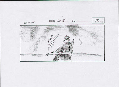
I couldn't find any Incredibles storyboards, but to illustrate this part of production to you a bit more, here's some two other modern favorites of mine; Wreck It Ralph (shown above) and Iron Giant (shown below).
Here's a nice clip that goes over the process of storyboarding (for Pixar's Monster's University)
Below shows more traditional storyboards made for the 'Playtime at the Lake' sequence from Iron Giant.
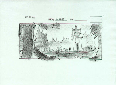
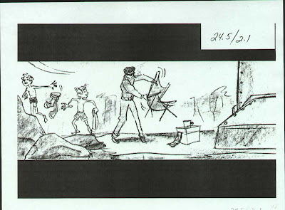
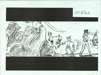
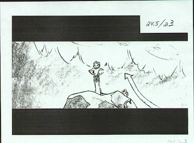
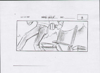
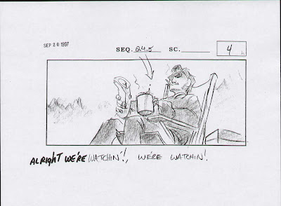
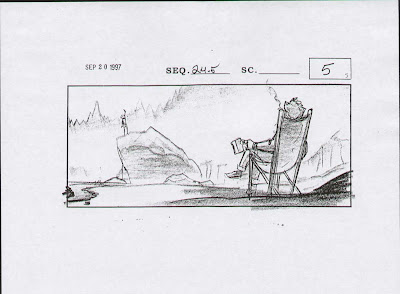
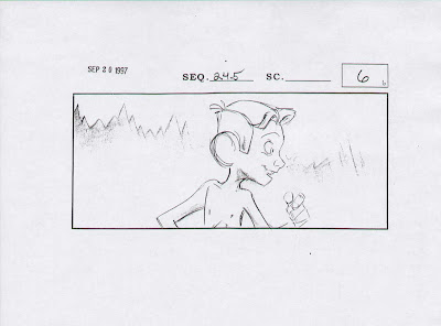
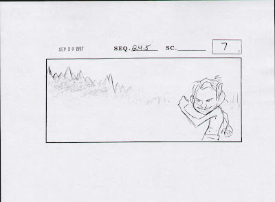
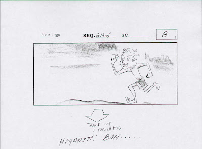
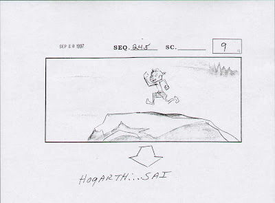
Loose, rough, simple story sketches, but it's the building blocks for designing the shots' compositions, how they will be laid out, what the backgrounds are going to be, and how the animated characters will be posed and animated later on.
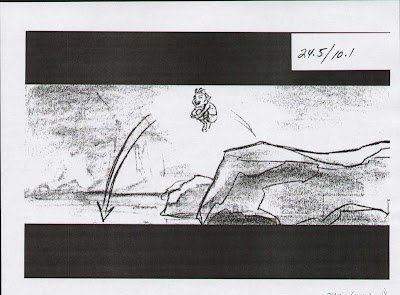
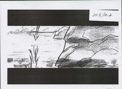
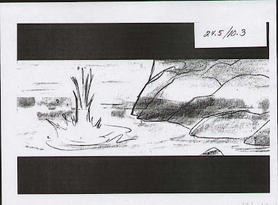
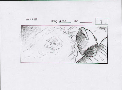
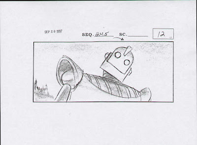
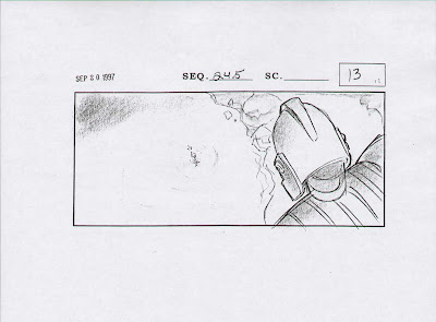
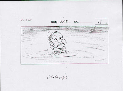
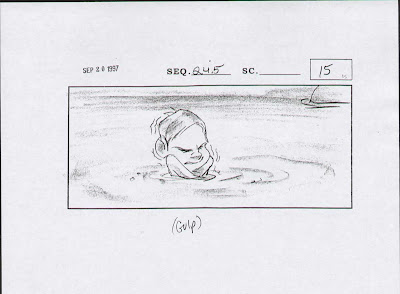
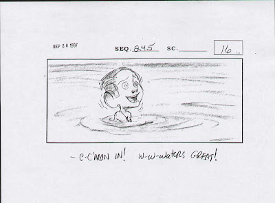
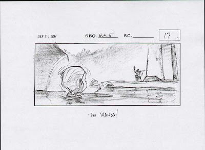
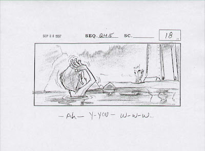
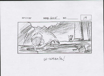
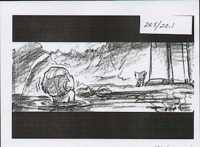
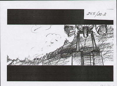
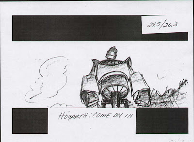
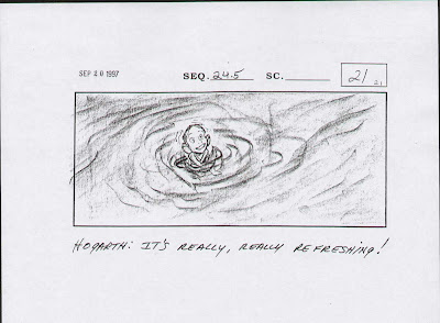
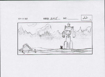
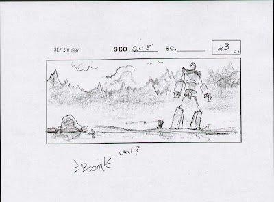
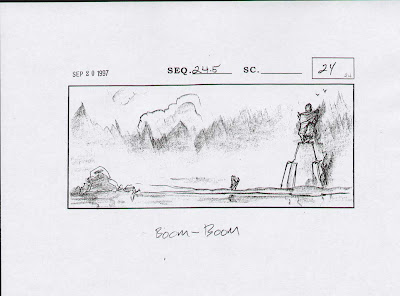
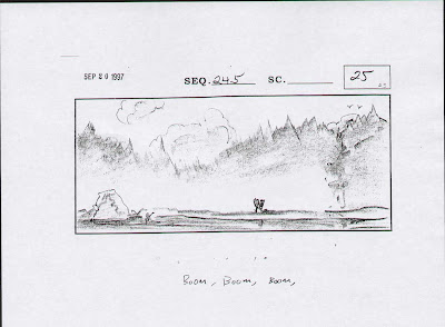
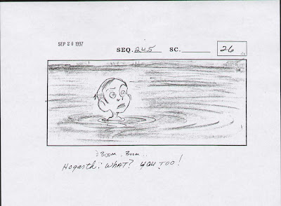
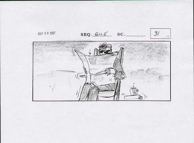
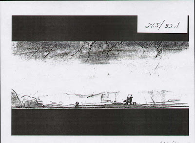
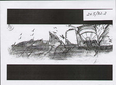
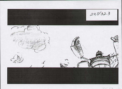
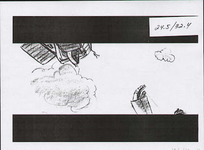
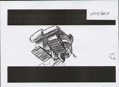
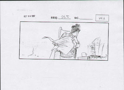
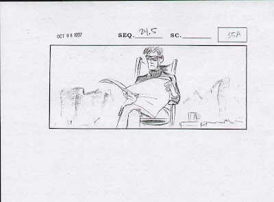
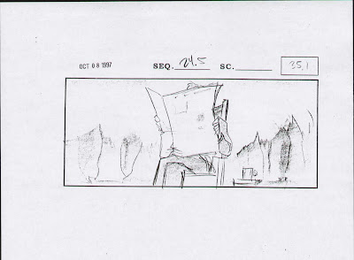
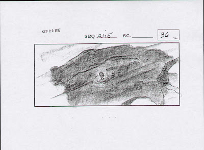
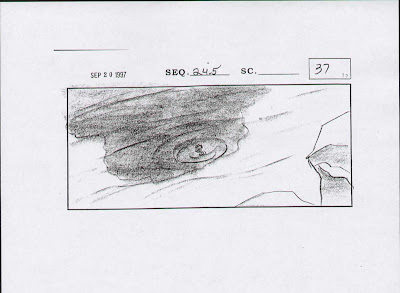
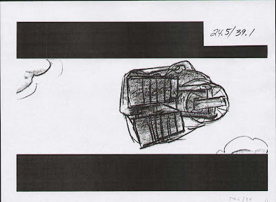
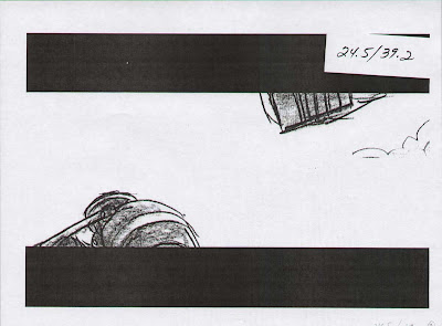
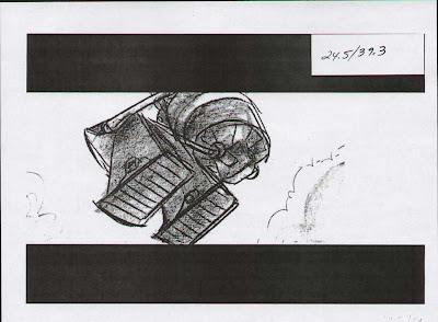
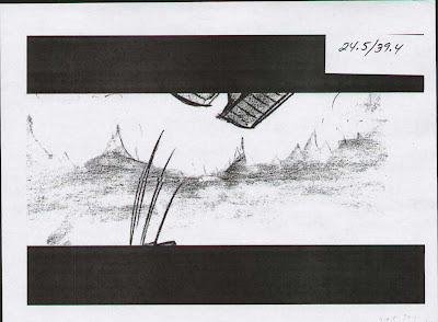
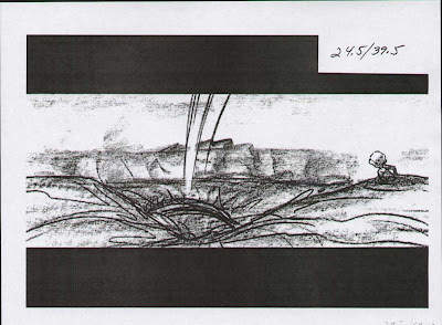
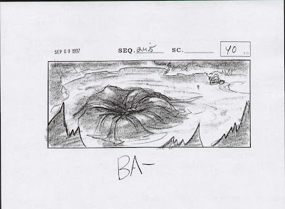
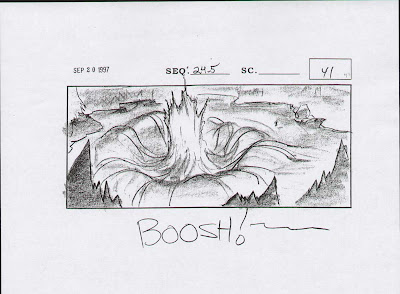
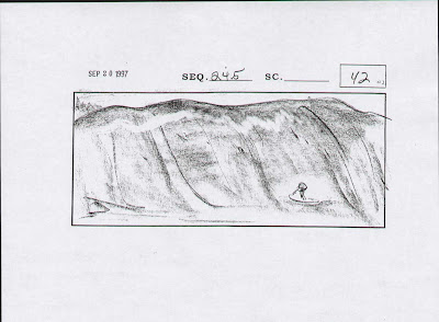
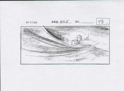
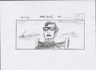
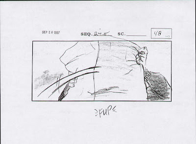
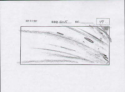
Many forms of visual art use composition to shape, form, and create a focal point in its image for the viewer's eye to be guided appropriately.
The reflection of her in the glass, lets the audience see her initial reaction at the same time we see the stitching in the suit. We cut close to really confirm what she's seen, then a close-up of her realization of who must have repaired the costume.
Continuing with my case study of the shot compositions from Pixar's film "The Incredibles". All images used here are ©Disney/Pixar (unless otherwise stated).
Cinematography is the art of composing the scenes of the film so they can visually tell the story in a functional and creative way. The purpose of composition is to direct the viewer's eye to the central point or "story" in your scene. Regardless of the particular subject, composition of the frame is important. The Incredibles has accomplished an appealing, efficient and artistic way of shooting all the sequences of the film to truly place the audience inside this world, and thus allow the viewers to get lost in the story.
Over and over again, the Rule of Thirds, Perspective/Depth, Intersecting Lines, Negative Space, Leading Lines/Diagonal Lines, Triangular Composition, and Character Line of Action are all displayed through out the second half of the film - in ways that show visual balance, and the relationship / connection between objects and characters within the frame, while helping to emphasize the development of the characters, along with their performance and the progress of the story.
Look at the sequence above; An establishing shot of the island that Bob is being transported to. A cross-dissolve to the next scene to show a passage of time, revealing him trying to get out of his pod, great use of overlay elements, creating depth, strong composition and placing him him in his new environment quite well with that vignette effect. Then a montage of him jogging through the jungle, looking for the robot he's supposed to knock out of commission. Each shot carefully chosen to evoke the feeling of time passing as he runs and walks through the jungle in search of his mission.
Notice Bob standing out from the foliage and trees, his color and body shapes helps with that, but mostly it's how well they've positioned the leaves and jungle elements around him, these elements create a frame within the frame.
In Illustration, Photography and Advertising Design - the arrangement of graphic elements, colors and lighting create a flow and direct viewers' eyes to certain area in a composition. But in film, there is another factor to consider, and that's Movement, it is also a major component in influencing the focal point. It can be broken down to the contrast between these key aspects - stillness and motion, fast and slow, movement pattern and travel distance.
This is what makes Cinematography unique to all other forms of image composition. Elements moving within the frame and the frame itself (the camera) moving as well, causing the composition to be ever changing and organic.
The sequence above shows Bob tracking the robot, then suddenly the first big action sequence of the movie begins. Bob gets attacked, he tears his suit as the robot slash/stabs him with the giant claw and scratches him, the camera briefly shows us the tear in the suit (an import story point for later).
Then we have some faster cutting shots and brilliant editing. The shorter amount of time a shot is on screen for, the cleaner the composition needs to be. The audience has less time ti instantly recognize who and what is in the shot and where to look and understand what is going on.
Then we have some faster cutting shots and brilliant editing. The shorter amount of time a shot is on screen for, the cleaner the composition needs to be. The audience has less time ti instantly recognize who and what is in the shot and where to look and understand what is going on.
The camera zooms in on Bob to show his reaction after seeing the robot for the first time nd to heighten the drama. A nice mixture of wide shots, close shots, and point-of-view shots follow as the action ramps up. The close shots are there to quickly see Bob's expression (and how he's feeling or what he's thinking) and the wide shots are there to give room and see the battle or chase take place, to remind the audience the danger Bob is in and to observe the choreography of the fight between them.
Up shots, down shots (high angles/low angles) are all present and accounted for, all to keep the action dynamic, clear, and exciting. You see over-the shoulder shots, arial shots, tracking shots that pan or follow the action as the character moves about the frame.
When timing a group scene, all moving elements have to complement each other and project one unifying feel to the scene.
I find that if every element in the scene is timed separately without regard to the surrounding moving elements, even though it looks just right by itself, the whole might appear very busy and will be missing a focal point.
Bob realizes he's just non winning the fight on these grounds, so he does a strategic retreat, the camera follows him during his escape, but the suspense level remain high as the robot is relentless in his pursuit. Showing the point of view of the robot chasing after him and then reverse shots add a nice element of tension and urgency to the sequence. Bob is tough and seemingly close to being indestructible, but he still feels pain, is rusty in his super-hero fighting skills, and all these shots and how the action plays out help to inform the audience of all this while pushing the story forward.
To see the character thinking we need to go in close and it's good to mix things up from all these wide shots needed to show the action clearly. Bob is just flying by the seat of his pants, his fists can't penetrate the robot's metal body, he's desperate he moves fast, tries different attacks to see what happens.
The shots have a nice variety to them. You can't stay up close all the time, otherwise you're too tight on the subject and you can't see what's going on, it feels too claustrophobic. If the shots were too far and wise all the time, we wouldn't be able to see the important details needed to develop the characters and progress the story.
The lava environment provides the chance to change the color palette to orange and yellow hues. This helps to amp up the danger, ominously dark, and more threatening to our hero. He's getting tired, he throws out his back, his old age is showing and the robot appears to be dominating the situation.
The following use of shot progressions is all about building up the suspense, cutting back and forth, different angles showing different points of view, all to place the audience in the hero's shoes, which raises that sense of tension.
Always present, the technique of motivating the cut, go from him looking over his shoulder. then you see his POV.
The shots get closer and closer, with the occasional cut-away to re-establish where the characters are in relation to each other and their environment. The lighting helps to raise the drama of the sequence.
This is a great part to talk about 'motivating the cut' - closely related to editing as much as composition, but choosing what point of view you want to show the audience works together with when and how to cut the camera. Motivating the camera is a simple technique of using visual cues to set up a cut or camera-move and in doing so, ease the audience into a new shot or new information.
Often in this film they use a character's eye line to motivate a cut. It helps ease the audience through the cut and into new information. (While also putting us directly in the character's shoes.)
The idea is to create as much continuity within the sequence as possible, making everything clear and easy to follow.
So as per the above sequences, ways to motivate the camera;
- Using a Character's eyeline/P.O.V.
- Having a character move on screen and adjusting the camera accordingly.
- Having a character exit frame.
There are many other ways, for instance; --- Having a character exit frame.
Ultimately what it comes down to, specifically for 'cutting', is the fact that a 'cut' is not natural, it doesn't happen in real life (unless you take really long blinks). Obviously we have seen enough film/television that we are accustomed to 'cutting', nevertheless, anything you can do to smooth out the transition will only help create and maintain the continuity of your sequence.
The action is well developed, just when you think its over, the machine remerges, seemingly unstoppable, the shots help to rekindle that suspense and sense of doom. The fiery orange and yellow color schemes sure help with the feeling of danger being present through out the scene.
Again with the dramatic angles, up shots and down shots to make the dominating character seem even more menacing, larger, powerful and in control of the scene.
The camera adjusts to show us what the character is thinking. Looking to where are character was looking (the floating rock as a possible escape route), telling us what his plan is with the position of the elements on screen.
The shots progress closer and closer in the last 3 cuts to make the situation more dramatic, adding to the intensity and giving our audience indication they should feel concerned over our main character.
With Bob's back cracking back into place and getting his second wind, he discovers that punching and throwing attacks at him does nothing, but pulling apart vulnerable body parts seems to work better.
The shots help tell the story, Bob manoeuvres around gradually getting the upper hand. We are reminded that this isn't Bob's first fight, when he's out-powered he uses his wits and strategy to gain the upper hand.
The choices in the view points and angles are meticulous and deliberate, all the help place the audience in situation, in the character's point of view and directly into the action.
Notice the black background in all these shots, this creates nice negative space, allowing for the characters' silhouettes, poses and therefore the action to be read clearly. Negative space can be the blank sky or wall behind a character, usually an area with no detail or texture, doing this helps the character to pop out from his background a bit, make his pose more readable, make the character more visible and instantly recognizable.
Obviously this is a useful design principle when staging shots for animation; to balance complex areas against empty areas. It would be meaningless to put one complicated pattern next to another, or to put an empty space next to another. The two types of areas only mean something when balanced by each other for contrast.
Seven years after Incredibles, Brad Bird also directed the film Mission Impossible: Ghost Protocol. I found it fascinating how his visual style of action, timing and pacing was transferred to the world of Live Action filmmaking. Many of the same techniques of scene development and editing were used in the film, you could almost tell (even if you didn't know who directed it) that this film was directed by an animator. A few times it just felt like a live action version of The Incredibles.
More examples around here that revolve around motivating the camera, and exploring more "what they are saying visually". Cutting back and forth placing the audience in the scene and situation.
Especially when we are doing a spying sort of thing with Bob trying to figure out what's going on with his mysterious client.
Over the shoulder shots, a perfect way to have to people sitting, facing each other and efficiently show the conversation, there's no fighting or action scenes, it's about the dialogue, the shots help to tell the story.
This is a total cheat, with the establishing shot showing how far apart they are, there's no way they would appear to be this close in all these 2-shots, but that's the beauty of cartoons, you can cheat the shots this way and it's not noticeable.
Setups like this reminds me again of how much they were obviously going for that James Bond feel and look.
Obviously this is a useful design principle when staging shots for animation; to balance complex areas against empty areas. It would be meaningless to put one complicated pattern next to another, or to put an empty space next to another. The two types of areas only mean something when balanced by each other for contrast.
Seven years after Incredibles, Brad Bird also directed the film Mission Impossible: Ghost Protocol. I found it fascinating how his visual style of action, timing and pacing was transferred to the world of Live Action filmmaking. Many of the same techniques of scene development and editing were used in the film, you could almost tell (even if you didn't know who directed it) that this film was directed by an animator. A few times it just felt like a live action version of The Incredibles.
More examples around here that revolve around motivating the camera, and exploring more "what they are saying visually". Cutting back and forth placing the audience in the scene and situation.
Especially when we are doing a spying sort of thing with Bob trying to figure out what's going on with his mysterious client.
Establishing shot to show us what the situation is and where they are.
Over the shoulder shots, a perfect way to have to people sitting, facing each other and efficiently show the conversation, there's no fighting or action scenes, it's about the dialogue, the shots help to tell the story.
This is a total cheat, with the establishing shot showing how far apart they are, there's no way they would appear to be this close in all these 2-shots, but that's the beauty of cartoons, you can cheat the shots this way and it's not noticeable.
Setups like this reminds me again of how much they were obviously going for that James Bond feel and look.
Body language comes in clusters of signals and postures, depending on the internal emotions and mental states, there is lots of non-verbal communication going on in every pose.
The flirting going on between the characters is kept subtle but notice how each time the camera cuts we get closer and closer to the characters, even though the characters appear to be perfectly comfortable with each other, the audience is meant to feel a bit more awkward with the situation, cutting in closer and closer like this allows the viewer to see their facial expressions and thus their acting more clearly.
The flirting going on between the characters is kept subtle but notice how each time the camera cuts we get closer and closer to the characters, even though the characters appear to be perfectly comfortable with each other, the audience is meant to feel a bit more awkward with the situation, cutting in closer and closer like this allows the viewer to see their facial expressions and thus their acting more clearly.
The following is the montage sequence. A classic way to show a passage of time, with no sound effects or dialogue in the audio track we have some nice jazzy music to accompany all these carefully chosen shots and scenes to display what seems to be the passage of months going by as Bob loses weight, has more time with his family, is generally happier with his new covert operation career, is making more money, buying new things... all masterfully showcased in this montage.
Camera pulls out to reveal the bow on a new car, you see just enough of it to know what it os, and still see Helen's body language reaction in the far background.
Classic method of showing both characters on screen, seeing the foreground character's reaction clearly, then push the focus of the camera lens to bring the background character in focus. Nice depth, perfectly clear what is going on in the characters' heads and the what the story point is.
We repeat the same cycle a few times, getting in shape, improved love life, quality time with the kids, pretending to go to work...
The compositions show all this without saying a word.
The two shots shown above; classic example of motivating the cut. We start with a close shot, he's bench pressing something, it stays on just long enough to realize what he's doing and wonder what he's lifting, then the long shot of him training by pressing a train.
You see the reflection of his body in the background (gettin in better shape), tilt the camera up to reveal his satisfied reaction.
A point of view shot, this cues the cut to see his reaction to what he's seen, the next shot shows us what he's thinking about the fact his suit is torn.
We instantly get reminded of his battle with the big robot and the fact that Bob had forgotten about it too, setting us up for the next sequence (his visit with his old costume designer, Edna).
Is she checking out his butt as he walks away?
Composition's main function is to draw the viewer's attention to what is happening in the scene. This usually means the character, but not always. Sometimes the point of the scene is the background or the prop that someone is holding. Whatever the point of the scene is, the background elements should be composed around this focal point. You don't want to compete with it by surrounding the focus with noisy details and wonky shapes.
We are reminded of how much fun the artists had with the production design of the film. Edna's place is extravagant, post-modern, sleek, clean, and over the top, just like her personality.
It reminds me of when I first looked through The Art of The Incredibles book in 2004, my thoughts on its content were mixed, I had just seen the film, I was excited to see the concept art and designs that was made in the film's production, but I was a bit disappointed, there were lots of very very simple character designs, barely resembling the final product, I was expecting lots of rough detailed super hero concepts that would later get refined and simplified and stylized. Boiling down the characters to their most simplified and basic shapes is an exercise done often to create some iconic looks.
I was a bit confused, I flipped through it a few times, set it aside and didn't give it much thought, I was maybe expecting visually rich, complex, super detailed artwork, paintings and renderings that more closely resembled earlier, rough versions of the final product.
A few weeks pass, and I had some spare time one weekend, I open the book and begin reading it. It usually takes me a long time to actually sit down and READ the text in an art book, cause to be honest, all I wanted art books were for the art. But I felt compelled to read some of it, out of curiosity.
So the book talks about the director's and artists' thought process, the feel, the look, the mood, the aesthetic they were going for in the characters, costumes, environment and location designs for the art direction of the film.
Then my mind proceeded to be.... officially.... BLOWN.
It made me re-think the whole essence of core principles of character design and think about it in new ways. All their crude, paper-cutout style character art suddenly made sense. They write about the visual language of the film and how the characters were designed with their personalities, their back story, and their instant readability/recognizability in mind. They explain how important it was to have very distinctive silhouettes/outlines made when they were developing the characters. So they started off with experimenting with many different BASIC SHAPES and FORMS to help the overall foundation and stylized/blocked-out shape of the characters to be fitting to their natural personality, their powers, their skills, and their story arc.
They go on about the sets and backgrounds as well, but for me the initial mindset they had and how they constructed the characters from scratch like this, really got my brain going, and it got me to profoundly reconsider all the things to consider about the very structure of character design, and how it influences the storyboarding, layout and composition process for all animated television series and animated feature film productions.
Example - "Wander Over Yonder" Style Guides by Craig McCracken & Alex Kirwan:
Sometimes creating an uneven balance of shapes and masses in a frame (large, medium, small), it automatically makes an image deeper, more dynamic, and interesting. Often some characters or elements need to be more prominent for story purposes.
Cuts to these insert shots, usually close-up so you see only the subject matter, only on screen for a brief moment, but each shot is necessary to sell to the audience what is going on.
The way the shots are composed aid in developing the characters, and thus help to structure and progress the story as we go along for the ride with the characters, as the characters discover things, we discover it with them, sometimes the camera reveal information to the audience that the character doesn't know yet, or other times the character gains new information but the camera hides it from the audience, leaving the viewers in suspense either way. The cinematography helps to shape where you look on screen, distributes the information to the audience and makes the viewers feel a specific way in that whole interchange of information as well.
Notice how Edna is now taller in the frame, higher than Bob, and at that moment she is also finally convinced to repair Bob's suit for sentimental reasons. But she does it on her OWN terms. The shots are now composed to have her above Bob in the scene, she's taken control of the situation, she now realizes she will also design him a new suit and relishes the challenge to create something new, more modern and thus a spark is re-kindled inside of her, as she obviously longs for the days that she would design costumes for "Gods" again.
See how that edge of the wooden beam points to her eyes, its purposefully done to lead your eyes and create flow through the image.
Comicbook artists do this all the time, here's a breakdown of a page from a Darwin Cooke graphic novel:
These invisible directional lines are everywhere in this film.
Helen is being all secretive, the framing an angles help to sell that feling.
The cinematography help to convey how Helen is feeling like Bob might be cheating on her, she feels isolated, vulnerable, the weather is even overcast, to make the mood feel a bit more somber.
The following shots is all about the scenery,
Bob in wonderment over the location he's being shuttled to.
For insight on the world of Animation Production Design, I'd recommend "Dream Worlds". The book is truly a unique visual delight, offering information into the development of animation classics like Bambi, Beauty and the Beast, The Lion King, Lilo and Stitch as well as a tantalizing examination of unfinished Disney projects. The author and prestigious Feature Animation Art Director Hans Bacher, has been a major influence on the design of Disney films for over 20 years. His work appears in Who Framed Roger Rabbit, The Lion King, Aladdin, Beauty and the Beast, Atlantis and Mulan, just to name a few.
All shots that help re-establish Bob's new assignment, as he gets back to work for his client. Getting transported to the island and deep inside the facility. He has his new suit, he's back in shape, comfort and confidence is oozing out of him.
Carefully chosen angles that show a characters point of view, then the camera reveals to us more and different information as the story progresses, we follow the characters on their journey, and we are shown the information we are needed to be shown at each particular turning point through out the film.
We know Bob is being setup, we don't know when or how. Here the shots and the music all convey a sense of ease, luxury, paradise, and all that good stuff... too good to be true.
Hi-tech, lavish, extravagant.
The cinematography showcases the art direction and location designs as it should be doing. We keep establishing the location over and over to really build this geography and environment in the viewer's mind.
How do they dream up these angles, perspectives, and progression of shots? It all starts with the magical world of story-boards. These sketches help everyone who is in charge of making the film visualize how the shots may look. Long before you spend thousands of work-hours building, sculpting, modelling, laying out, animating, lighting, and compositing the shots, which is all phenomenally labour-intensive.
Because these sketches are simple pencil drawings (or digital sketching/painting, with a stylus pen and drawing software), it's faster and easier to see what works and what doesn't work, what flows well or what doesn't. This is how the composition of each shot begins to take form, usually months and years before the shots are actually prepared and produced for frame-by-frame computer-generated animation.
I couldn't find any Incredibles storyboards, but to illustrate this part of production to you a bit more, here's some two other modern favorites of mine; Wreck It Ralph (shown above) and Iron Giant (shown below).
Even though Iron Giant was a 2D animated film (with the Giant and Props/Vehicles as 3D elements), rough layouts and lighting guides like the ones shown above, were made during and after the main storyboarding phase for reference for the background and character layout departments. Notice the shadow guides of nice tones and contras with 3D arrows are indicating the light source direction. See how the rim lights and shading blocks in distinctive shapes that help to construct strong compositions to create the atmosphere and mood of the sequence.
- The two main functions of Storyboards -
Staging: The positioning of characters in each scene for maximum emotional content and clear readability of actions. In Animation it refers to the purpose of directing the audience's attention, and make it clear what is of greatest importance in a scene; what is happening, and what is about to happen. This can be done by various means, such as the placement of a character in the frame, the use of light and shadow, and the angle & position of the camera. In live-action this is referred to as 'Blocking'.
Storytelling: Each panel's sketch clearly communicates to an audience the important ideas expressed through the action of each scene. This is all compromised of different types of shots, framing / editing principles, and scene transitions, and how they are used by filmmakers to help tell a story. These depict many elements like the poses and expressions of the characters, as well as how the scenes will cut and how close (or far) the camera is to the subject.
The storyboard is the simplest and most practical way of conveying specific visual ideas to multiple people. Sort of like a blueprint for all sorts of creative media. Traditionally storyboards were drawn on paper from pen or pencil (and other drawing supplies). However, with integration of computers, storyboards can be created entirely on the computer now. But still, even nowadays, someone always has to imagine the scenes and compositions, and draw it.
Here's a nice clip that goes over the process of storyboarding (for Pixar's Monster's University)
Below shows more traditional storyboards made for the 'Playtime at the Lake' sequence from Iron Giant.


Loose, rough, simple story sketches, but it's the building blocks for designing the shots' compositions, how they will be laid out, what the backgrounds are going to be, and how the animated characters will be posed and animated later on.


What is the key to success in visual storytelling? A willingness to collaborate, the flexibility to evolve, and an understanding of the basic rules of cinematography.
Many forms of visual art use composition to shape, form, and create a focal point in its image for the viewer's eye to be guided appropriately.
In Graphic Design: Composition refers to the structure and organization of elements within a design; it concerns the process of combining distinct parts or elements to form the visual unity and harmony within the design piece.
In Photography: Composition is used to enhance the impact of a shot by creating a clear and appealing image. This is achieved through the techniques of proper visual balance, lighting, framing, leading lines, perspective, open space, depth of field, color, texture, symmetry & asymmetry.
In Filmmaking: Composition is a process of continuous change created by the control of its three basic elements - placement of people and objects within the frame; movement of people and objects within a fixed frame; and movement of the frame itself. These elements must be designed in a specific way to draw the viewer’s attention to the focus of the scene.
In Animation: Composition is the process of staging your characters, objects and backgrounds so that they are unmistakably clear, an action so that it is understood, a personality so that it is recognizable, and a mood so that it can affect the audience.
The reflection of her in the glass, lets the audience see her initial reaction at the same time we see the stitching in the suit. We cut close to really confirm what she's seen, then a close-up of her realization of who must have repaired the costume.
Converging lines have the power to draw the eye to key focal points in a shot and to impact the 'feel' of an image greatly. Diagonal, horizontal, vertical, and leading lines everywhere, can all affect images differently, but are always utilized to strengthen the shots composition and controlling where you want your audience to look.
Observe how the backgrounds and props in the following few shots create these lines that lead your eye through the scene. Lines are everywhere around us. In people, trees, walls, shadows-you just have to look for them. These natural lines can strengthen composition by leading the viewer's eyes toward your subject. Diagonal lines can add energy. Curved lines can add soft elegance. Using a road or path as a leading line can add depth.
For converging lines, sometimes their purpose is to draw attention at the point of convergence, it depends on the positioning of the subject and the camera's point of view, either way, it's goal is usually to create a center of focus, but it can help strengthen the story theme as well.
For example; in "The Shining" the converging lines of perspective gave the film a claustrophobic feel, as if the walls of the hotel were literally collapsing onto Jack's mind.
"The Dark Knight" also utilized production design and strong compositions to create these graphic images, and in many cases, it strategically placed the point of convergence in the precise center of the frame. Perhaps symbolizing the growing chaos and collapse of Gotham city's morality, and the choices the city's inhabitants make as individuals and as members of society.
Using the geometry of the backgrounds to create these strong leading lines and perspective were purposefully done through out this film, and The Incredibles made similar choices as well.
Nice clear outline of Bob in those claws. As he's lifted up and the empty space around him is due to the camera's angle, silhouetting him over the sky.
Camera gets up close as the danger of the blades get ready to slice him up.
Bob hears Syndrome off-screen, he look, and it motivates the camera to cut to the next shot.
Moments of clarity need to go in with extreme close-ups. To clearly drive home the acting, expressions and internal thought process of the character.
Syndrome is framed by the robot's legs, great depth in the shot with Bob in the foreground, tension is rising, big story elements are being revealed, compositions are clear, dynamic, and powerful.
Soft light, classic technique to sell the whole 'flashback' sequence.
Great angle, great pose, showing his anger, showing how much Mr. Incredible towers over him, extra-dramatic lighting.
Cut to his POV, to make certain we know what he's thinking.
Many of these shots display a nice interchange of upshot to downshot that illustrates the powerful/powerless principle. The higher a character is in the frame, the more powerful they tend to feel. And the lower in frame that they are, the more powerless they tend to feel.
Up shots tend to make the character seem bigger, more menacing, more powerful. Down shots tend to make the character look weaker, less threatening, and powerless. The larger the character is within the frame, the more powerful they seem.
This chosen point of view obviously shows us how much trouble the character is in.
When you have such a dramatic vertical drop and the spacing between the characters getting bigger and bigger, you show these big bird's eye view shots and the reverse angle, with a big up-shot to see Bob diving into the water, then back to Syndrome as he lands on the rock watching him fall.
A very darkly lit set, necessary to keep it realistic, and the location is a tomb in essence, stalagmites everywhere help to create some interesting lines, shapes and compositions.
Finishing off with a wide shot helps to conclude the whole sequence and we see him leaving (satisfied and content).
Lots of up shots to show them both in the frame in a well-balanced way, since Edna is only half Helen's height, they needed to shoot scenes appropriately.
Quick shots to establish that they are obviously in a more high-tech testing area.
They bounce back between these two shots (shown above and below) because the characters will be focusing on the show in front of them, so we flip back and forth, and by looking over their heads, we see how grand the presentation is in relation to them.
Colors and lighting are appropriately dismal as Helen begins to question everything.
Up shots and down shots, in this case not symbolize power or dominance of one character over another, but because of the angles back and forth to show the characters clearly.
The building blocks of strong composition are always present - Framing, Subject Placement, Balance, Lines, and Simplicity.
We follow Bob around, almost like we're his sidekick, the camerawork places the audience in his shoes as he infiltrates the compound, making it feel like a James Bond film as he breaks into the enemy headquarters.
Back in the lava wall room, we re-establish where he is, the scale of the location he's in.
Various angles to show and remind the audience where he is, what his plan is, and what he's doing and about to do.
Composition at its simplest and most effective. The background is absent of details, black, the light source is the gaint computer monitor, with graphics akin to Apple computers, minimalist and super-simplified.
The purpose is to make everything graphically easy to understand, but also to setup a big reveal later as Bob (and the audience) gradually discover Syndrome's ultimate plan.
A nice reaction shot of Bob with a smirk, satisfied that he cracked the password by remembering the 'KRONOS" word carved on the wall underground where he found Gazerbeam's body. The fact we see a skeletal corpse and the idea of Helen assuming Bob is cheating on her are darker, more adult themes than what Pixar was known for at that time (and even since then).
Great depth in this shot, revealing Edna's mild disinterest over Helen's lack of acceptance, and showing Helen's initial boredom towards trying to track Bob down. Then it turns into concern as the camera tilts down, placing her in a position that is powerless, her body language evokes fear and confusion.
The camera tilts down, raising the horizon line up, make her seem a bit more vulnerable.
Classic shot progression, as the scenes cut back and forth to the computer screen and back to Bob, the framing gets closer and closer to slowly intensify the situation as he realizes all his old pals have been executed.
The locator device comes into focus in the foreground. Still keeping Helen's obvious body language/feelings into view.
All that's important is the character's thoughts, showing the audience what they are feeling, nothing else is important, and the cinematography reinforces that perfectly.
The following shots are crazy, the lights come on, dozens of canons pop out of the wall, we see in full light Syndrome's wacky computer room and now it's suer security system at play.
The following shots get progressively faster and faster, to the point that in the end the canons are on;y on screen for 1/24th of a second.
The shots get tighter and tighter, intensifying the ire situation he's in. then finally fades to black from his point of view as he gets engulfed by the inflating glue-balls.
Camera zooms out to show the satchel, the angle is reversed to see her POV.
Camera dolly with Syndrome as e walks to the imprisoned Mr. Incredible.
Beautiful color. Great shapes. The blues are a nice contrasting color against Bob's costume. A clear distinction that the red (good guy) hero is trapped in the cold, grey/blue, evil stronghold.
To show the dramatic tension rising, we have to go up close on Bob, he hears the voice of his wife through the transmission.
Now you'll see how the layering of all these planes can be used in many types of shot to give a sense of depth but also to help keep the eyes focused on where they need to be.
Now we begin the most suspenseful part of the film. The Missile Lock sequence is very carefully crafted to gradually build up massive tension and stress inside the plane. Helen pleads with the missile launcher on the island to call of the air strike, while trying her best to avoid the missiles...
She look down, it cues the cut to see her POV of the radar console. Cuts back to her as she looks out the front window, this cues the cut to an over-the-shoulder shot of the missiles in the sky coming towards her. This cues the cut to see her reaction, see below, she quickly gets in the pilots seat, reaches her hand out, the next shot hooks-up to see her finger hitting the buttons to release the heat flares.
Evasive action! The shots are quick, usually at an angle, plenty of interior/close shots mixed with exterior shots to mix things up, reminding the audience that the counter measures are not working, the missiles are closing in...
Cut back to Syndrome's strong hold, Bob is desperate, without revealing that his wife and kids are the ones on board, Syndrome shows us how ruthless he can be.
Helen screams at Violet to put a force field around the plane, something beyond her abilities, Helen is desperate to try anything. The compositions help to evoke that sense of urgency.
The subject is off-center, so there's room to reveal the threat approaching them. Introducing the missiles flying in to view!
Fast succession of cuts, showing us the gravity of the situation, different angles and perspective the compositions are helping the building up of the fantastic tension and danger. We can't look away, we have no idea how they'll escape.
The shots all cut closer and closer, Helen, Violet, the missles, the radar tracking the missiles. We're on the edge of our seats waiting to see what will happen.
Helen's last ditch effort is to bundle them up in a sphere, hoping her stretchy, fire-proof/damage-proof suit will protect them all.
A dramatic rescue and the audience sees the terror in the kids' eyes all at the same time.
They look up, this cues the camera to cut to their point of view. Every shot (as always) was all purposefully done, with meaning and flow, leading the viewers' eyes and controlling the information shown to the audience.
It's all about connections and the relationships on screen between specific elements. Here we have her close in the foreground, the camera adjusts to reveal Bob, sobbing in the distance, out of focus, you see that she feels for his grief, she walks off screen, we end the sequence with a wide shot of Bob, alone, big empty space, which is how our character feels.
Cinematography creates the visual narrative of the film so that the audience can consciously and unconsciously identify with the story and the characters.
Over-the-shoulder shots are the most typical but most effective way to film a conversation.
To show her growing self-confidence we need to be up close, the micro-expressions on her face tells the audience what she's thinking and feeling.
Used often in the film - a wide shot of the background character, and a medium or close-up of the foreground character with their backs to the other character, and we can clearly see their expressions and thought process, an efficient way to shoot a scene, lots of information can be presented.
Opposing forces in the characters' designs and poses are apparent through out the film, sometimes they are strikingly dynamic.
Another example of this is from Andreas Deja's blog where he writes about Line, Shape, and Form.
What a nice sequence this was. She infiltrates the compound, sneaks in, and discovers a bit about this place in regards to how much of a big operation it is, the grand scale of it all, it showcases how experienced she is in this sort of thing, her and Bob were old veterans for this whole stopping-world-domination-plans routine back in the good 'ol days.
The eyes tell the audience what the characters are thinking and feeling, often the most important thing about a close-up on an actor. Read this fascinating article by David Bordwell about how much information the eyes can communicate to an audience.
Lots of deep focus shots, depth of field being used, lots of layers to go through as she makes her way deeper inside the compound, searching for a way to find out where Bob is being held.
With all these backgrounds that are quite empty in detail, it makes the main subject we're focusing on abundantly clear, and easy to see. When I see all that empty space, it reminds me of the animated series Pocoyo. A show that displays the beauty of simplicity in design and composition at the highest level.
The minimalist approach is great for the target pre-school audience - and a big reminder of how simple and clean you can create compositions with thoughtful character designs, colors, and strong posing to push the visual narrative.
See how many leaves/branches are pointing towards the main subject. The lighting the colors - all draw our eyes to where they need to look.
Shot progression again, the framing gets tighter as the situation gets more stressed and intense.
Centered compositions. Bob has nothing left to live for, he's a broken man, the subject demands our attention, that's when you can ignore the rule of thirds.
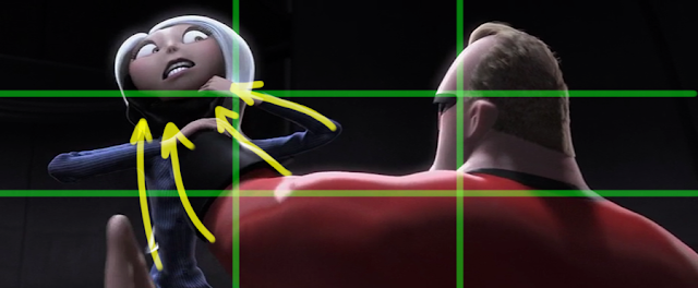
The placement of the arc in the background behind his head is no accident, this subliminally leads your eye to his face where the director wanted your eyes to go to instantly when the camera cut this scene, the composition helped in telling the audience where to look so they could see what the character is feeling immediately.
A vignette effect with the carefully placed lighting and foliage around Dash creates a deliberate composition that leads your eyes to his face so you can read his reaction.
Placing the camera here ads a sense of danger for the audience, as if the viewers are in the henchman's sights, placing us in the character's shoes, momentarily we feel what the Violet feels, a target.
The henchman & Dash is framed by the foreground overlay elements of the trees, branches and Violet herself.
The fast-paced battle about to start with the camera orbiting around the heroes, the enemy flying in fast form all directions, a busy and detailed background behind everyone - all these factors require carefully planned compositions. This is to keep the action clear, the filmmakers didn't want to do a Michael Bay move and confuse the audience in a lightning storm of shaky camera moves, and unrecognizable on-screen craziness that creates visual chaos.
Flipping back and forth from Syndrome's point of view looking up at his catch, then a view back to Syndrome as we see the delight on his face.
A wide shot to re-establish where we are, what situation our heroes are on and the where the characters are at in relation to each other.
Body language and how the character moves and performs helps to decide the appropriate angle and composition of the shot, you don't want to frame your scenes in such a way that the characters won't have room to move, or get cropped off awkwardly.
Mickey Quinn does a great job of narrowing down the basics for illustrating body language cues here:

This is one of my favorite parts of the movie, this vehicle is about to land on the city street at an insane height and speed, but Bob has no problem keeping control as they rocket through the highway and somehow the vehicle holds to ether in one piece. The shots are very well chosen, the pacing is super quick, the vehicle is zipping through traffic, switching lane, all while Bob and Helen argue over which exit to take. The action and the cuts are frantic and everything is shaking and moving insanely fast.
We cut in closer and closer as we learn why Bob wants to deal with the giant robot menace alone.
The tender moments require extreme close-ups, so the audience can get inside their heads and know exactly what the characters are feeling and share in those emotions.
The robot comes in on the scene and crushes the vehicle. The first of many 'bird's eyeview' shots and other extreme angles. Similar to The Iron Giant film, there were surely many challenges in the planning of these scenes to give a great sense of enormity and scale to the robot. You only have so much room within the frame, and when there is such a drastic difference in size between your two opposing characters, you have to find innovative ways to clearly show the action that's going on - without the audience feeling confused and disoriented (like a Michael Bay film, *cough cough*).
High angles and low angles everywhere, all to place the audience in the same point of view as the heroes or the that of the giant robot.
A nice and quick Flashback, visually connecting the audience to the device - Bob remembers about the gauntlet remote device, we see what Bob sees in his mind.
These inserts of the robots view point helps to get inside the robot's cold & calculated head, like the Terminator, simply hell bent to destroy.
Whatever direction a prominent character is looking - it will influence the general composition no matter where the other elements are. As long as they don't overpower the character, the audience will have the tendency to look in the same direction, anticipating something important to the development of the story.
We cut in closer on the claw so that we see the proximity between it and Bob running away, reemphasizing the potential danger.
This POV shot is great, places us in Bob's shoes for a moment, we see how close he was to the remote to stop the robot, the hand out shows the desperation.
Framed by the claw, we see what he sees (in the foregrounds) while we can also make the connection between the character and the object, during his little monologue.
The overall compositional forms of the layout are always clear, you can isolate major shapes then divide them up into subsections, But you can still see the big shapes dominating the compositions, and the details being subservient to them through many levels.
All the characters are different heights, this is no accident, grouping the family as one element and Frozone singled out on the other side, creates nice compositional balance.
Whoa, who's this? Animated caricatures of legendary animators Frank Thomas and Ollie Johnston? Director Brad Bird made certain they were featured in his previous film Iron Giant as well. They voiced their own characters too!
With all these characters facing each other, turning their heads, having multiple conversations, the camera is allover the place, bouncing around, but it's never confusing and we see all the characters viewpoints, things seem to be settling down, it seems like the movie is winding down, but Helen checks her home messages on the phone and there's something wrong the camera then focuses on her.
The way the following sequence is shot is like an episode of COPS, the hand-held camera feel as we follow the family inside their house, really adds that urgency to it, we had forgotten about Syndrome and the Baby, so we're left wondering what loose end has been overlooked.
Up shot again, because he is the dominant character in this interplay.
Extreme straight-up and down shots; more than ever the suspense, urgency and importance of the situation has reached a new level of intensity. The Parr family cam't fly, and it seems like Syndrome has the upper hand as he kidnaps their baby.
Point if view from the baby, seeing his mother vanishing from sight and rising dangerously high up in the air.
We cut to a wide shot so we can see Syndrome's pan for escape.
With the time if day clearly being dusk, it's a nice way to make this world more believable, more real, and adds some nice colors to the backgrounds during this intense sequence.
Camera follows Helen as she gets thrown up in the air to intercept her baby. We follow along for the ride as if we the audience is right there with her saving the child.
A quick glance at his fancy car, and we know what's about to happen, Bob gets rid of a pricy item that Syndrome himself help Bob to buy, no it's used as a tool for Syndrome's demise.
A story point Edna had brought up earlier was that capes were more trouble then they are worth, a cruel and dramatic irony for our antagonist.
Finishing off with a wide shot helps to conclude the whole sequence and we see him leaving (satisfied and content).
Lots of up shots to show them both in the frame in a well-balanced way, since Edna is only half Helen's height, they needed to shoot scenes appropriately.
Quick shots to establish that they are obviously in a more high-tech testing area.
They bounce back between these two shots (shown above and below) because the characters will be focusing on the show in front of them, so we flip back and forth, and by looking over their heads, we see how grand the presentation is in relation to them.
Closer shots to show reactions clearly.
Camera cuts wide to make room to show what is going on.
Colors and lighting are appropriately dismal as Helen begins to question everything.
Up shots and down shots, in this case not symbolize power or dominance of one character over another, but because of the angles back and forth to show the characters clearly.
Each shot was carefully composed and designed to lead the viewer's eyes to specific areas, but also, thanks to the movements of the elements on screen, allows the viewers' eyes to travel around the screen. The characters in relation to their background and staging the character and props in such away that their poses are clear and their actions are readable. One method of achieving this is to use Attraction Tricks. This will help to use the characters themselves to improve the composition of the shot and believability in the actions they perform.
Attraction Tricks
The direction of the viewer's attention to what the storyboard artist (and you the animator) considers the important parts of the image. This is one of the most important aspects of designing shots. This is particularly important for moving images, as they are not on the screen for a long time; the viewer does not have the choice to study it for an extended length of time. One must get the viewer looking at the place where the new action will occur before it is all over. The following are ways of achieving this:
Appearing and Disappearing
Changes on the screen will get the eyes attention. Something changing from existence to non-existence, or vice versa, can be pretty dramatic.
Blinking
Have the character blink before they moves, it will get the viewer's attention. Always blink a character's eyes during a head turn.
Anticipation and Overshoot
Anticipate actions by having the objects backup a bit before moving in a desired direction and then have them go past their final position, creating a recoil and cushion into the next pose.
The See-saw effect
Lead the viewers attention to certain parts of the screen by having a a swinging back and forth, a pendulum or fulcrum swing, and even a repeating cycle or transformation, an on-screen element of something rubbing back and forth while everything else is motionless.
Parallel action
To emphasize the connection between two things on different parts of the screen, attract attention to them by having them move in contrast to each other, one should be leaning forward when the other leans back. This can create dynamic forms and intersecting lines to show power, weight, balance, stability, or elegance, while adding angles and contrast to any opposing forces within the image.
Line of action
This helps your poses "read". It makes them clear and understandable and gives them a distinct non-ambiguous direction.
Silhouettes
The position and posture of the characters in the scene can greatly effect the staging and composition, in addition, it can help to place the characters within the situation, making them part of their environment and the story.
Tension and Release
Tension is created by making shapes seem unbalanced, nearly tipping over. Release comes from objects being firmly placed. Some ways to strengthen the pose (and overall composition) of the character is to create a nice silhouette, this is the overall shape of a pose.
Hesitation
Make object(s) pause a little before moving them to their final positions. This builds up anticipation.
Speed adjustment
If a physical action happens too quickly to see, simply slow down the time scale. This is similar to scaling an object to fit on the screen properly.
The building blocks of strong composition are always present - Framing, Subject Placement, Balance, Lines, and Simplicity.
We follow Bob around, almost like we're his sidekick, the camerawork places the audience in his shoes as he infiltrates the compound, making it feel like a James Bond film as he breaks into the enemy headquarters.
Back in the lava wall room, we re-establish where he is, the scale of the location he's in.
Various angles to show and remind the audience where he is, what his plan is, and what he's doing and about to do.
Composition at its simplest and most effective. The background is absent of details, black, the light source is the gaint computer monitor, with graphics akin to Apple computers, minimalist and super-simplified.
The purpose is to make everything graphically easy to understand, but also to setup a big reveal later as Bob (and the audience) gradually discover Syndrome's ultimate plan.
A nice reaction shot of Bob with a smirk, satisfied that he cracked the password by remembering the 'KRONOS" word carved on the wall underground where he found Gazerbeam's body. The fact we see a skeletal corpse and the idea of Helen assuming Bob is cheating on her are darker, more adult themes than what Pixar was known for at that time (and even since then).
Great depth in this shot, revealing Edna's mild disinterest over Helen's lack of acceptance, and showing Helen's initial boredom towards trying to track Bob down. Then it turns into concern as the camera tilts down, placing her in a position that is powerless, her body language evokes fear and confusion.
The camera tilts down, raising the horizon line up, make her seem a bit more vulnerable.
Classic shot progression, as the scenes cut back and forth to the computer screen and back to Bob, the framing gets closer and closer to slowly intensify the situation as he realizes all his old pals have been executed.
The locator device comes into focus in the foreground. Still keeping Helen's obvious body language/feelings into view.
All that's important is the character's thoughts, showing the audience what they are feeling, nothing else is important, and the cinematography reinforces that perfectly.
The following shots are crazy, the lights come on, dozens of canons pop out of the wall, we see in full light Syndrome's wacky computer room and now it's suer security system at play.
The following shots get progressively faster and faster, to the point that in the end the canons are on;y on screen for 1/24th of a second.
The shots get tighter and tighter, intensifying the ire situation he's in. then finally fades to black from his point of view as he gets engulfed by the inflating glue-balls.
Camera zooms out to show the satchel, the angle is reversed to see her POV.
Camera dolly with Syndrome as e walks to the imprisoned Mr. Incredible.
Beautiful color. Great shapes. The blues are a nice contrasting color against Bob's costume. A clear distinction that the red (good guy) hero is trapped in the cold, grey/blue, evil stronghold.
To show the dramatic tension rising, we have to go up close on Bob, he hears the voice of his wife through the transmission.
The kitchen shot has some great stuff going on, but mainly the entire scene is made to lead your eyes to the primary and secondary focus points. The core principles of composition dominate; Rule of Thirds, Depth, Lines, Balance, and most importantly - breaking up planes & drawing attention to important elements. As an example of this sort of thing, here's an analysis by Dave McCaig, from the 1956 film "Bigger Than Life":
Illustration A is a screen grab of James Mason. Shot after awesome shot, great compositions, visual hierarchy, moody shadows, this movie is GREAT reference.
The director (Nicholas Ray) and cinematographer (Joseph MacDonald) have done a great job of leading the eye around for the most part, although the dude below Barbara Rush gets lost in the shot.
Illustration B shows where my eye is tracking while I look at the frame. B1 is a large flat area of high contrast, next to the biggest shapes on screen, and is on the left hand side (as we’re trained to read) so my eye *might* go there first. B1, B2 and Mason’s shirt create a pattern, so I’m drawn to the bow tie at the center of that pattern, and then up to his face. There are more reasons we look to his face, but I'll cover that in another section when I can get to it.
B3 is the highest point of contrast in the image, and is likely the first place most people will look.
B4 gets pretty lost here. The seated guy’s position is kind of awkward, but he’s not likely very important to the scene, so that can be a good thing. You would not want to go out of your way to draw attention to this guy if he was not relevant to what is going on. You just need to know he’s there if you look for him, to maintain continuity from scene to scene.
Basically, while this works great as a movie frame, if this was a colored comic panel the existing color choices would not be great. All the colors have similar values, contrast, and hue. Mason’s suit ties into both the wall and the actress’ skirt. The seated man is essentially invisible, and his flesh tone makes it easy to mistake his face for Barbara Rush’s hand. The whole image looks very flat, and it’s hard to tell that the wall at B1 is not on the same plane as B2.
The easiest way to deal with all of these problems as an illustration or comic panel is to break up all the planes distinctly.
In Illustration C, I’ve indicated how I’d separate the important elements and depth of field. Plane 1 is extreme FG, Plane 2 is the seated guy, and Plane 3 the BG. Plane 3A is distinguished because even though it’s in the BG, that character has to pop forward a bit and have higher contrast.
In Illustration D, I’ve used dark blues for Plane D1, earth tones for Plane D3, and a midway blend for plane D2. There are lots of ways to pop D2 if you need to, but we actually want that seated guy to be unnoticed.It's essential that he have his own plane though, because If he were part of plane D3, he’d tie into the woman, and if he was part of D1’s scheme, it would look like James Mason was talking to a midget. Note that I kept the high contrast shirt on the woman in the BG, but made her pop more by making her skin tone more saturated than the background.
In Illustration E, I reversed the color combos, just so you could see that there are many ways to tackle the same problem, depending on who’s more important, the mood, the environment, etc. Emphasis is a little more focused on Barbara Rush in illustration D, and on Mason in Illustration E. Overall, focus is going to be more towards Rush no matter what, due to the layout of the shot.
Now you'll see how the layering of all these planes can be used in many types of shot to give a sense of depth but also to help keep the eyes focused on where they need to be.
Now we begin the most suspenseful part of the film. The Missile Lock sequence is very carefully crafted to gradually build up massive tension and stress inside the plane. Helen pleads with the missile launcher on the island to call of the air strike, while trying her best to avoid the missiles...
She look down, it cues the cut to see her POV of the radar console. Cuts back to her as she looks out the front window, this cues the cut to an over-the-shoulder shot of the missiles in the sky coming towards her. This cues the cut to see her reaction, see below, she quickly gets in the pilots seat, reaches her hand out, the next shot hooks-up to see her finger hitting the buttons to release the heat flares.
Evasive action! The shots are quick, usually at an angle, plenty of interior/close shots mixed with exterior shots to mix things up, reminding the audience that the counter measures are not working, the missiles are closing in...
Cut back to Syndrome's strong hold, Bob is desperate, without revealing that his wife and kids are the ones on board, Syndrome shows us how ruthless he can be.
Helen screams at Violet to put a force field around the plane, something beyond her abilities, Helen is desperate to try anything. The compositions help to evoke that sense of urgency.
The subject is off-center, so there's room to reveal the threat approaching them. Introducing the missiles flying in to view!
Repeat it with this reverse angle to really remind the audience how screwed they are.
Fast succession of cuts, showing us the gravity of the situation, different angles and perspective the compositions are helping the building up of the fantastic tension and danger. We can't look away, we have no idea how they'll escape.
We see a bit of empathy from Syndrome's main assistant.
The shots all cut closer and closer, Helen, Violet, the missles, the radar tracking the missiles. We're on the edge of our seats waiting to see what will happen.
Leading Line are important for moving subjects as well, they are naturally occurring lines that direct the viewers eye and draw attention to certain parts of the shot. If your shot has leading lines you want them to be drawing attention towards the subject and the main focal point, not away from them. In this case she's only in the shot for 3 frames (0.12 sec.) so the composition has to be abundantly and instantly clear to the audience so their eye can catch what's going on.
Helen's last ditch effort is to bundle them up in a sphere, hoping her stretchy, fire-proof/damage-proof suit will protect them all.
A dramatic rescue and the audience sees the terror in the kids' eyes all at the same time.
They look up, this cues the camera to cut to their point of view. Every shot (as always) was all purposefully done, with meaning and flow, leading the viewers' eyes and controlling the information shown to the audience.
It's all about connections and the relationships on screen between specific elements. Here we have her close in the foreground, the camera adjusts to reveal Bob, sobbing in the distance, out of focus, you see that she feels for his grief, she walks off screen, we end the sequence with a wide shot of Bob, alone, big empty space, which is how our character feels.
Cinematography creates the visual narrative of the film so that the audience can consciously and unconsciously identify with the story and the characters.
Over-the-shoulder shots are the most typical but most effective way to film a conversation.
To show her growing self-confidence we need to be up close, the micro-expressions on her face tells the audience what she's thinking and feeling.
Used often in the film - a wide shot of the background character, and a medium or close-up of the foreground character with their backs to the other character, and we can clearly see their expressions and thought process, an efficient way to shoot a scene, lots of information can be presented.
To show the disgust on her face, we have to go in close with this tight shot.
Opposing forces in the characters' designs and poses are apparent through out the film, sometimes they are strikingly dynamic.
Another example of this is from Andreas Deja's blog where he writes about Line, Shape, and Form.
Everything is in magnificent balance for this moment from the film 101 Dalmatians.
So many graphic lines are directed toward the main business of Roger's finger touching Anita's nose. Her long neck, the lines in her hair and the curve of her nose clearly point to the subtle contact about to happen. Roger's whole body leans forward toward Anita's face, and every line, from folds in the fabric to his basic anatomy, leads the viewer's eye to the specific area of interest.
Then there is the background's layout. Look at how those lines defining the wooden edge of the sofa seem to move upward toward the characters' heads.
(I love the perspective change of the sofa's right side, it's flat and dimensional all at the same time!)
There is an absolute unity between the shape language in the background and in the characters. It feels like ONE artist is responsible for the entire image.
We all know that Disney animation is about family entertainment, but vintage stuff like this is also high art. Milt Kahl animated both characters in the scene.
What a nice sequence this was. She infiltrates the compound, sneaks in, and discovers a bit about this place in regards to how much of a big operation it is, the grand scale of it all, it showcases how experienced she is in this sort of thing, her and Bob were old veterans for this whole stopping-world-domination-plans routine back in the good 'ol days.
The eyes tell the audience what the characters are thinking and feeling, often the most important thing about a close-up on an actor. Read this fascinating article by David Bordwell about how much information the eyes can communicate to an audience.
Lots of deep focus shots, depth of field being used, lots of layers to go through as she makes her way deeper inside the compound, searching for a way to find out where Bob is being held.
See how she's clearly framed by the BG elements, and those elements flow around the whole composition. The sub forms in the background are being pulled along and held together by opposing forces. The whole layout design is one force. This is a repeated theory through out much of the film, the more you look for it the more you see it, everywhere.
Basic Shapes
Framing
Overlapping Forms
Clear Staging
Negative / Positive Space
Avoid Symmetry
Opposing Forces
Staging Things in Groups
Screen Spacing and Scale
Screen Spacing and Scale
Hierarchy / Visual Balance
Form Over Detail
The important factor is 'relationship'. The relationship of all elements on screen, their size/volume, proximity and placement, relative to each other within the frame. This all effects the composition.
Great illustrators like Floyd Gottfredson [A], Mel Shaw [B], Frank Frazetta [C] and N.C. Wyeth [D] just to name a few, masterfully follow these principles of using visual balance and basic shapes to create focal points by positioning and posing the subjects thoughtfully. Strong compositional design is always functioning to draw attention to the important areas of the image, despite what personal visual style the artist (or filmmaker) may have.
When you finally get down to the tiniest details, they too follow the physics of the larger forms. You could take any part of this image and break it down into its larger basic forms and other smaller sub-forms. You'll find the same logic everywhere through out the film.
With all these backgrounds that are quite empty in detail, it makes the main subject we're focusing on abundantly clear, and easy to see. When I see all that empty space, it reminds me of the animated series Pocoyo. A show that displays the beauty of simplicity in design and composition at the highest level.
The minimalist approach is great for the target pre-school audience - and a big reminder of how simple and clean you can create compositions with thoughtful character designs, colors, and strong posing to push the visual narrative.
See how many leaves/branches are pointing towards the main subject. The lighting the colors - all draw our eyes to where they need to look.
Shot progression again, the framing gets tighter as the situation gets more stressed and intense.
Centered compositions. Bob has nothing left to live for, he's a broken man, the subject demands our attention, that's when you can ignore the rule of thirds.
Awesome silhouettes and rim lights off their bodies.

The placement of the arc in the background behind his head is no accident, this subliminally leads your eye to his face where the director wanted your eyes to go to instantly when the camera cut this scene, the composition helped in telling the audience where to look so they could see what the character is feeling immediately.
A vignette effect with the carefully placed lighting and foliage around Dash creates a deliberate composition that leads your eyes to his face so you can read his reaction.
Placing the camera here ads a sense of danger for the audience, as if the viewers are in the henchman's sights, placing us in the character's shoes, momentarily we feel what the Violet feels, a target.
The henchman & Dash is framed by the foreground overlay elements of the trees, branches and Violet herself.
The fast-paced battle about to start with the camera orbiting around the heroes, the enemy flying in fast form all directions, a busy and detailed background behind everyone - all these factors require carefully planned compositions. This is to keep the action clear, the filmmakers didn't want to do a Michael Bay move and confuse the audience in a lightning storm of shaky camera moves, and unrecognizable on-screen craziness that creates visual chaos.
Flipping back and forth from Syndrome's point of view looking up at his catch, then a view back to Syndrome as we see the delight on his face.
A wide shot to re-establish where we are, what situation our heroes are on and the where the characters are at in relation to each other.
Body language and how the character moves and performs helps to decide the appropriate angle and composition of the shot, you don't want to frame your scenes in such a way that the characters won't have room to move, or get cropped off awkwardly.
Mickey Quinn does a great job of narrowing down the basics for illustrating body language cues here:
Up shots for Syndrome because he's in command of the situation.
These POVs of the robot always help to tell the audience what the machine is thinking.
This is one of my favorite parts of the movie, this vehicle is about to land on the city street at an insane height and speed, but Bob has no problem keeping control as they rocket through the highway and somehow the vehicle holds to ether in one piece. The shots are very well chosen, the pacing is super quick, the vehicle is zipping through traffic, switching lane, all while Bob and Helen argue over which exit to take. The action and the cuts are frantic and everything is shaking and moving insanely fast.
We cut in closer and closer as we learn why Bob wants to deal with the giant robot menace alone.
The tender moments require extreme close-ups, so the audience can get inside their heads and know exactly what the characters are feeling and share in those emotions.
The robot comes in on the scene and crushes the vehicle. The first of many 'bird's eyeview' shots and other extreme angles. Similar to The Iron Giant film, there were surely many challenges in the planning of these scenes to give a great sense of enormity and scale to the robot. You only have so much room within the frame, and when there is such a drastic difference in size between your two opposing characters, you have to find innovative ways to clearly show the action that's going on - without the audience feeling confused and disoriented (like a Michael Bay film, *cough cough*).
High angles and low angles everywhere, all to place the audience in the same point of view as the heroes or the that of the giant robot.
A nice and quick Flashback, visually connecting the audience to the device - Bob remembers about the gauntlet remote device, we see what Bob sees in his mind.
These inserts of the robots view point helps to get inside the robot's cold & calculated head, like the Terminator, simply hell bent to destroy.
We have a tendency to look toward where the vanishing point is since, especially in the case of architectural environments, all lines parallel to the horizon and among themselves, will be pointing at it, creating an obvious centre of interest.
Whatever direction a prominent character is looking - it will influence the general composition no matter where the other elements are. As long as they don't overpower the character, the audience will have the tendency to look in the same direction, anticipating something important to the development of the story.
We're in the middle of the big climatic action sequence, we've got destruction, speed, explosions, power, ice walls, rocket fire, throwing, sliding, stomping... and all the cinematography compliments this. The angles are divers, and always dynamic, lively, energetic, clear, energetic, vibrant and never drawing attention to itself, you get lost in the action and you can't wait to see what's going to happen next.
More dynamic angles and poses than you can shake a stick at.
We cut in closer on the claw so that we see the proximity between it and Bob running away, reemphasizing the potential danger.
This POV shot is great, places us in Bob's shoes for a moment, we see how close he was to the remote to stop the robot, the hand out shows the desperation.
Framed by the claw, we see what he sees (in the foregrounds) while we can also make the connection between the character and the object, during his little monologue.
When a character ha an epiphany, you have to go it for the close-up.
A quick and practical way to show the proximity of the robot to the group of heroes.
The overall compositional forms of the layout are always clear, you can isolate major shapes then divide them up into subsections, But you can still see the big shapes dominating the compositions, and the details being subservient to them through many levels.
Bob's faces are hilarious.
Rule of Thirds - Bob in the bottom third and the robot in the upper third, nicely spaced out, Bob's making sure he's targeting the core of the machine in hopes of taking it out the same way he did with the smaller version.
It's the big finish, we need to keep the scene intense with these close-ups!
The camera nicely trucks out through the hole to reveal that it's been disabled.
All the characters are different heights, this is no accident, grouping the family as one element and Frozone singled out on the other side, creates nice compositional balance.
Whoa, who's this? Animated caricatures of legendary animators Frank Thomas and Ollie Johnston? Director Brad Bird made certain they were featured in his previous film Iron Giant as well. They voiced their own characters too!
Brad has always been a huge admirer of their work on all the old Disney classics.
With all these characters facing each other, turning their heads, having multiple conversations, the camera is allover the place, bouncing around, but it's never confusing and we see all the characters viewpoints, things seem to be settling down, it seems like the movie is winding down, but Helen checks her home messages on the phone and there's something wrong the camera then focuses on her.
The way the following sequence is shot is like an episode of COPS, the hand-held camera feel as we follow the family inside their house, really adds that urgency to it, we had forgotten about Syndrome and the Baby, so we're left wondering what loose end has been overlooked.
You can still see the big shapes dominating the compositions, and the details being subservient to them through many levels.
Extreme straight-up and down shots; more than ever the suspense, urgency and importance of the situation has reached a new level of intensity. The Parr family cam't fly, and it seems like Syndrome has the upper hand as he kidnaps their baby.
Point if view from the baby, seeing his mother vanishing from sight and rising dangerously high up in the air.
We cut to a wide shot so we can see Syndrome's pan for escape.
With the time if day clearly being dusk, it's a nice way to make this world more believable, more real, and adds some nice colors to the backgrounds during this intense sequence.
Camera follows Helen as she gets thrown up in the air to intercept her baby. We follow along for the ride as if we the audience is right there with her saving the child.
A quick glance at his fancy car, and we know what's about to happen, Bob gets rid of a pricy item that Syndrome himself help Bob to buy, no it's used as a tool for Syndrome's demise.
A story point Edna had brought up earlier was that capes were more trouble then they are worth, a cruel and dramatic irony for our antagonist.
This kid could have been seriously hurt from that crashing wreckage!
The camera pan back and forth revealing them getting in costume.
And finally the animated end credits deserves an article by itself. Super saturated colors, blocky/spiky designs. It's sharp, angular and graphically hyper-stylized, with bold, dynamic design elements through out, lots of energy, super-saturated colors, and lots of punch to it. Watch it here.
SUMMARY - The Shots Tell The Story
Here's some more helpful terminology in regards to shot framing basics from Karen Lloyd's Storyboard Tutorial Blog:
Extreme Wide Shot
Whether it's Long Shots, Full Shots or Extreme Wide Shots, all of these ‘wide shots’ have one thing in common - they are answering the same question: “Where are we?”
This is the first question you generally want to answer for your audience. Now, I’m not saying a wide shot has to be the first shot of the film or new location/sequence. But it should be pretty darn close to first. Again, it depends on the story and if there is something you’re trying to hide from the audience on purpose.
Long ShotWith the long shot, you’re not establishing the ‘world’ so much as establishing the character(s) in that world. So the audience finds themselves saying, “Oh, there they are.”
This is a good thing. The audience always wants to know where everything and everybody is. If we need to see the big picture, the world where it’s taking place, we’ll go with an extreme wide shot. When we need to see the characters and what they are doing, the long shot works great.
Too wide and we can’t see the ‘who‘. Too close and we can’t see the ‘where‘.
The long shot gives us both.
Full ShotThe extreme wide shot was all about the environment. It told us the big picture of where this story is taking place. The long shot had the perfect balance between ‘where’ and ‘who’. It gave us a closer look at who the story is about and where they are in their environment.
In the full shot, the environment (or the ‘where’) falls much more by the wayside. This shot is all about the ‘who’. This shot wants us to look at our characters. It’s the ‘big picture’ of just that character (or characters). We should already know where they are by the time we get to a full shot.
Medium ShotThe background is not important. It should have already been established and we know where we are. It’s all about the character and what they are doing.
It’s also great for when you don’t need to see their feet. Which makes it an awesome ‘cheat shot’ for animation. Why animate a walk cycle if you don’t need to? Just pan the background.
The medium shot is your trustworthy friend. It will never betray you and will always be there for you. So what does this shot say?
“I’m gonna show you something.”
Close-Up
The close-up is an ‘information giver’. An ‘emotion teller’. A ‘look at this-er’. But to really sum up what this shot says, it would be: “This is important.”
It’s taking a step closer to someone and them whispering something to you.
It tells us the important stuff we need to know to understand the story. If the audience needs to see something, grab them by the nose and drag them to see it with the close-up. This shot is all about the subject, be it character or object. It’s telling us something. It’s showing us something. Something important.
Extreme Close-UpIt can be super intimate or it can just be a very useful information tool. It depends what you’re showing and why. I find it to be much more of an information-teller myself. Because to me this shot says: “You need to see this and ONLY this.”
In this shot, nothing else matters but the subject matter. And it’s usually going to be a particular part of that subject matter. Backgrounds are unimportant (or unrecognizable) in the Extreme Close-Up. It’s all about one particular thing. One particular part of your character. The eyes. A hand. The mouth. This is when it can be a super-intimate shot. On the other hand, if you’re showing an object, the Extreme Close-Up is a very effective information-giver.
And this is ONLY in regards to framing. When you get into color, lighting, angles, perspective, negative space, depth of field, visual balance, directional lines, and the many other aspects that make up cinematography... you can see how layered and complex creating this imagery can be, and how much thought is put into each and every shot.
Pixar movies are carefully planned scene by scene. I've always found that The Incredibles features exceedingly well done compositions, included on the DVD sets are insightful interviews and audio from both the directors and the animators who worked on the film.
Other filmmakers that are worth watching and analyzing…
Akira Kurosawa Films: Kurosawa makes great use of context rather than objects to tell a story. The concepts of "less is more" apply for his works more than any other. The way a character is standing or acting within frame tells the story without cramming many events into one picture. His films inspire the use of simple body language to tell what's going on rather than complex/visually noisy action.
Sylvain Chomet Films: In my opinion, one of the most under-rated animation filmmakers of our time. He uses exquisite design sense for characters and layouts with beautiful lighting and colors. He structures detailed and marvellous compositions to develop the locations, characters and plot. All with films that devoid of dialogue.
Hayao Miyazaki Films: Miyazaki makes great use of foreground, mid-ground and background. Rather than showing all of each character all the time, very often characters are blocked by objects in the foreground and middle ground, helping to place the characters within the situation, making them part of their environment and the story.
Wes Anderson Films: Anderson has a bit of a magical touch in his approach to filmmaking. He makes very careful use of color and size relationships of different characters and objects within many shots. Anderson likes to use shallow compositions where most of the scenes are flattened into a middleground. His movies almost always reserve the color red for things that he wants to have most attention in a shot. His strong visual style is worth studying and appreciating.
Research the films shot by these Master Cinematographers: Bruno Delbonnel, John Toll, Roger Deakins, Tonino Delli Colli, Vittorio Storaro, and Conrad Hall - and these are just a few of many directors of photography that are responsible for the shot compositions of the best looking live-action films from the past couple decades.
So who was responsible for the shot composition of The Incredibles?
I believe it's a complex and collaborative combination of several key people on the production:
Cinematographers Andrew Jimenez, Patrick Lin, and Janet Lucroy are most likely the people that made many of the decisions regarding camera work, layout and lighting at the CG level of production, guiding the layout team on how to block the shots and lighting process with the technical artists and lighting/shading supervisors. Lead Storyboard Artist Mark Andrews and the rest of the storyboard team had the task of being the first to visualize the script by illustrating all the shots and planing out how the action should be staged. With this long collaborative process, the storyboard artists were the main crew to sketch out the scenes, sequences, and angles for every shot in the film. In addition, I imagine Production Designer Lou Romano and Art Director Ralph Eggleston influenced the shot designs of the film with their artistic supervision of the color palettes and character/location designs Of course I can't go on without crediting Brad Bird, the film's writer/director had the final say in shaping the look of the film from concept to completion, and he was the main unifying vision for the whole movie. He probably supervised and guided the Cinematographers, Storyboard Artists and Layout Artists on the style, design language, and visual motifs he intended to have for his film and had thoughts and direction for how each sequence should be setup, staged and executed. Brad (along with the producers and art directors) approved the final framing, camera moves, colors, and lighting for the whole film. |
CONCLUSION
When I first saw The Incredibles in theatres, it stood out to me, it was the first CG-Animated film that seemed to have cinematography strongly in mind. I never really noticed any str shot compositions for other 3D/CG animated films until then. Not only is it is still my favorite Disney/Pixar film, but in my opinion; one of the all time best superhero/family/action-comedy movies ever made. The more times I watch this particular film, the more clues I notice in how they developed the visual language necessary to make the movie so engaging and entertaining. Here's a bit more info regarding the making of the film.
As you've seen, The Incredibles uses these powerful graphic tools to invoke visual metaphors for various themes within the film. The shots and angles chosen for every scene of this film are not used solely because it 'looked cool' - the way the film was shot is inherently tied to the story, character development, and thematic ideas of the film.
To learn more about all the principles I've covered in these articles and how they relate to Live Action film, please visit this fantastic analysis of cinematographer Roger Deakins (my personal favorite) as the author explores the movie "The Prisoners", and breaks down this master's work.As you've seen, The Incredibles uses these powerful graphic tools to invoke visual metaphors for various themes within the film. The shots and angles chosen for every scene of this film are not used solely because it 'looked cool' - the way the film was shot is inherently tied to the story, character development, and thematic ideas of the film.
If you're truly interested in this type of discussion, I highly recommend picking up the amazing book "The Visual Story" written by Bruce Block, which contains volumes about screen space, camera angles, color, perspective, lenses, and even the rhythms of a traditional Hollywood narrative screenplay. In one of the most interesting sections; "Story and Visual Structure," the author illustrates his ideas about story beats by analyzing the plot structure of films like Spielberg's "Raiders of the Lost Ark" and Hitchcock's "North By Northwest." It's a must read for film fanatics who care about this kind of stuff.
For those of you interested in the craft of creating strong illustrative compositions, I highly recommend picking this more advanced book on the subject, "Framed Ink: Drawing and Composition for Visual Storytellers" written and illustrated by Marcos Mateu-Mestre. The author introduces the reader to a step-by-step system that will create the most successful storyboards and imagery with the most engaging and appealing visual storytelling. He explains and illustrates with incredible detail on how to set up your shots and sketch out your stories while educating you on the intricacies of visual language in film. Keeping in mind all the emotive stances, character development, and the drawing of the environmental setting to fully develop the visual narrative.
To learn more about the fundamentals of scene planning and storyboarding, check out "Storyboarding: Rules of Thumb" by Sergio Paez and Anson Jew, it offers nicely illustrative examples of basic storyboarding concepts, as well as sound, career-oriented advice for the new artist. This book also features a number of veteran storyboard artists sharing their experiences in the professional world.
Also, I never really covered anything about the variety of different looks that can be achieved by using different lenses and depth of field (something I find was really pushed to new artistic levels in later years, like in the film Wall-E). Check out this tutorial on the subject, very informative:
The art of lighting and lens choices have become increasingly important and predominant in 3DCG animated films, thanks to the advancements in the technology over the past 10 years.
The art of lighting and lens choices have become increasingly important and predominant in 3DCG animated films, thanks to the advancements in the technology over the past 10 years.
Richard Adenot sent me this compilation of 6973 screen capture images of The Incredibles, all displayed in one picture. It's like a detailed and elaborate version of the original color script Pixar had done in the pre-production of the film. It's crazy to see all the color values of all the shots in the film at once, it's like seeing the whole movie at once.
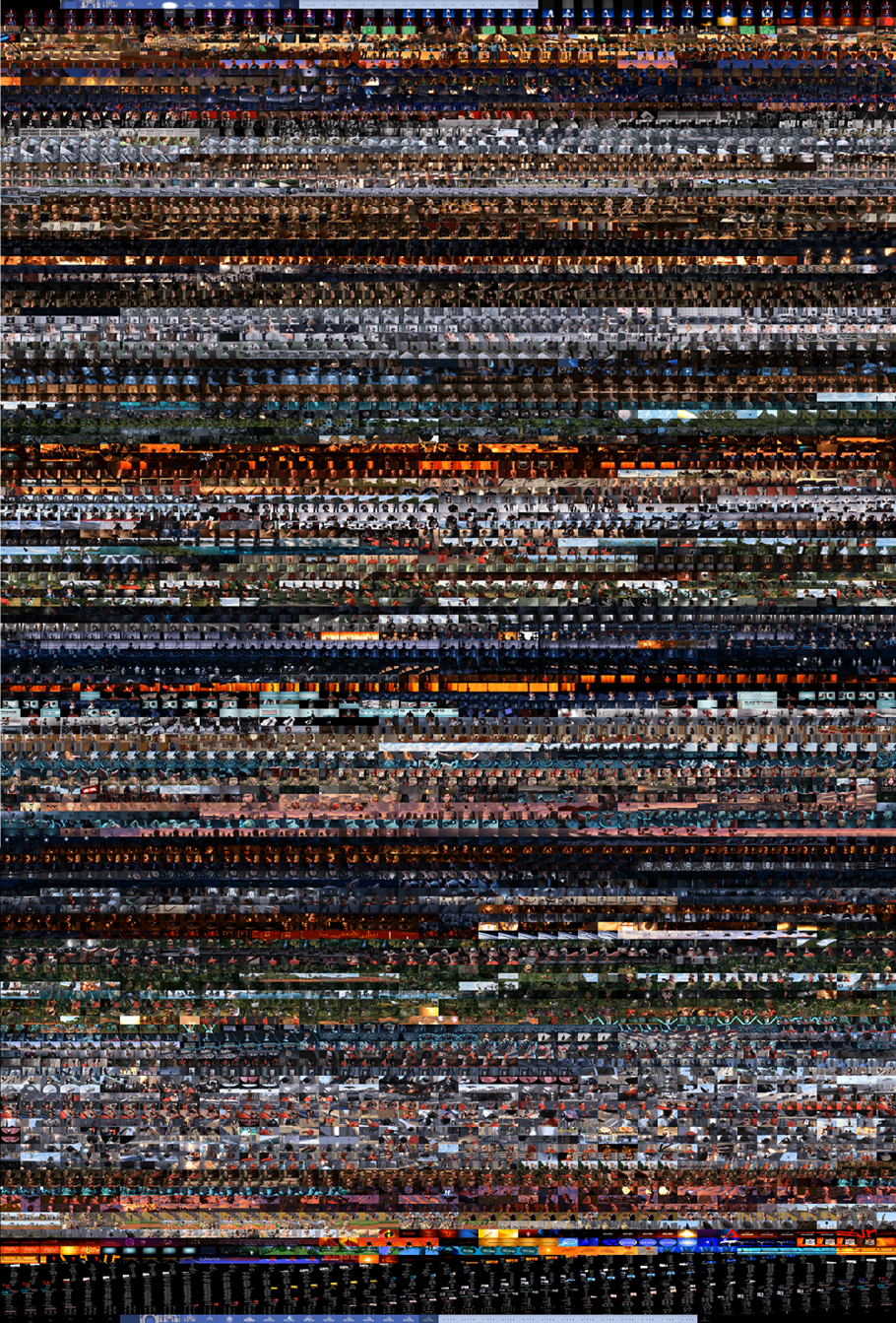 I believe that instead of looking at composition as a set of 'rules' to follow - it should be viewed as a set of ingredients that can be taken out of the pantry at any point and used to make a great meal. Any good chef knows you shouldn't throw everything in the pot at once, but rather, pick and choose your ingredients here and there in order to make a good meal. This 'meal' can be for anything: a photograph, a storyboard, an illustration, a book cover, a movie poster, a advertising design layout, and of course, la live-action or animated film. It should be seen as a set of tools that can be taken out of one's compositional tool belt at any given time, for the construction of a great image.
The goal of cinematography will always be to emphasize the subject/mood/action of the moving image and make it both easily understood and aesthetically pleasing to the viewer.
I hope you enjoyed this breakdown on the shot compositions of The Incredibles.
Thank you all for your awesome comments, support, and the sharing of these articles.
Thank you all for your awesome comments, support, and the sharing of these articles.


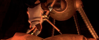


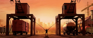


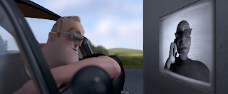


.jpg)


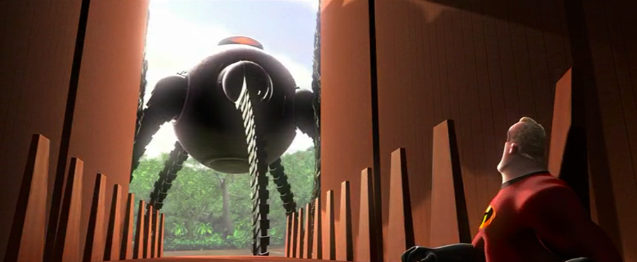


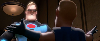






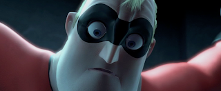


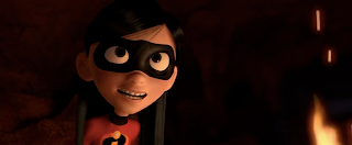


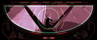


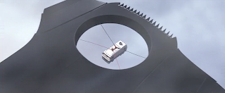


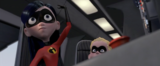


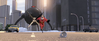


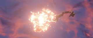


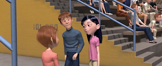

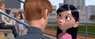


17 comments:
Amazing post ; Thank you Ron !
Thank you some much!
The whole analysis is amazing, so inspiring and teaching...
Hope you still have energy for doing another in the future.
Great Job!
Ron, this is the best study on modern composition and staging I've ever seen. After reading this, I know my next project won't look as it would have.
Thank you very much
This will literally be a resource that will help the rest of life. Thank you.
All this is PURE GOLD! Thanks, Dear RON, amazing stuff!
what a resourceful tool. this has been such a pleasure to read. so informative and greatly appreciated. thank you thank you thank you.
My area of study and work is not even remotely related to film, and I'm not a movie buff by any means. I just stumbled upon this post by accident, and I'm so glad I did. Bravo on your passion, erudition, and great ability to educate both experts and novices alike. You've changed the way I watch films.
I've learnt so much from this blog to use in illustration and comics, thanks for making this available.
just wanted to say I am very appreciative of the time you took to explain this thank you!
I loved your great study about cinematography. It's very well explained and the guide images were excelent. Please continue developing such amazing studies!
Cinematography is the art of composing the scenes of the film so ... 2framedposters.blogspot.com
A fantastic read. Thank you
This is an incredible study!! This needs to be a book. Seriously. Where do I buy this in paper form???
Thank you! I learned a lot!
i like this movie
sbobet
maxbet
แทงบอลออนไลน์
nice work
waiting for EP2 in 2018 yay
บาคาร่า
sbobet
maxbet
losmovies - Pixar has again proved that it's ethics and capabilities are inexterminable even for the tough-willed Dreamworks, which are gradually attempting to catch up on with standards. But with Pixar's new title, we once more experience a great gratifying animation which deeps you inside by it's humorous and enthralling plot and keeps you laughing out loudly until the very end. Dreamworks' titles compared to Pixars are not too peculiar, but they seem to rip all their titles from Pixar and create a fake illusion of originality. Now that Pixar has created another chef-d'oeuvre, no doubt Dreamworks will once more rip the idea and create a title relating to superheroes
See more:
watch hostiles online free
sicario putlocker
watch death wish 2018 online free
star wars a new hope putlocker
super troopers 2 putlocker
solo a star wars story putlockers
all the money in the world putlocker
Post a Comment