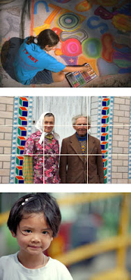
 Be a picture director.
Take an extra minute to compose your photograph so that the reason you are taking it is clearly evident. Control your canvas by moving subjects, props, or your angle to add context and see things in a better way.
Subject placement
 .
.To hold the attention of the viewer, give your pictures a bold and dramatic arrangement. Avoid putting your subject directly in the center of the picture unless you are striving for a formal arrangement in which the subject firmly commands attention.
Rule of thirds: In candid pictures of people, it's often wise to follow the traditional rule of thirds. Imagine a pair of lines dividing the picture into thirds horizontally and a second pair dividing it into thirds vertically. Place the most important visual element—usually the face (or eyes in a close-up)—on one of the points where the lines intersect.
Move it from the middle.
One of the most common mistakes of amateur photographers is placing the subject smack dab in the middle of the frame. This makes a picture more static and less interesting. That's why one of the most popular guidelines in photography, painting and cinematography is the Rule of Thirds.
Imagine a tic-tac-toe board over your viewfinder and position the subject along one of the lines or at one of the intersections. If your subject fills most of the frame, position a focal point (like those smoldering eyes) at one of the intersections.
With landscapes, keep the horizon along the lower third to give a feeling of spaciousness. Position the horizon along the upper third to give a feeling of nearness or intimacy.


Open space: When a person moves across your camera's field of view, the final image usually has much more impact when the subject is off-center. Leave the open space in the direction in which the subject is headed. Similarly, if a subject is looking off to the side, it's best to leave more space in that direction.
 Focus on the good stuff.
Don't include too much. Extra elements can confuse things. Strengthen your subject by eliminating all unimportant components and background clutter.
 What’s that thing behind you?
Before you shoot, take a look around for an uncomplicated backdrop that complements the subject instead of competing with it. Beware of trees or poles sprouting from your subject's head. Even better, find a background that draws the viewer's eye to the most important part of the picture.
 Lines that lead.
Lines are everywhere around us. In people, trees, walls, shadows—you just have to look for them. These natural lines can strengthen composition by leading the viewer’s eyes toward your subject. Diagonal lines can add energy. Curved lines can add soft elegance. Using a road or path as a leading line can add depth.

 Step into another dimension.
Framing your subject with elements in the foreground can also add scale and depth to pictures. Overhanging tree branches, doorways, anything that covers at least two sides of the photo can give a three-dimensional effect that invites viewers into the image.
 Photography is like a circle – There are no right angles.
Experiment with different angles. Eye level is great for a lot of shots. But if you want more from your photos, you have to explore. Get close and fill the frame. Crouch down and shoot up at your subject or shoot along the floor. Get up on a chair or table and shoot from above. Just be careful or you might be icing your ankle while viewing the results.
 Watch out for the edge!
If your subject is in motion, give them plenty of space within the frame to move into.
 Find your balance.
Off-center subjects can be balanced on the opposite side of the frame with leading lines, shadows, and objects in the foreground or background.
Balance can also be achieved by creating simple geometric shapes. This makes images naturally easier to decipher and more pleasing to the eye. This photo is a good example of subjects creating a triangle, which brings strong balance and unity to the image.
 Leave something to the imagination.
Sharp, detailed images are the norm. That's why it can be fun to purposely leave your main subject a little out of focus. Just focus on something in front of or far beyond the subject to create a dream-like effect.

1 comment:
Fantastic! Thanks for posting this Ron!
Post a Comment